Published
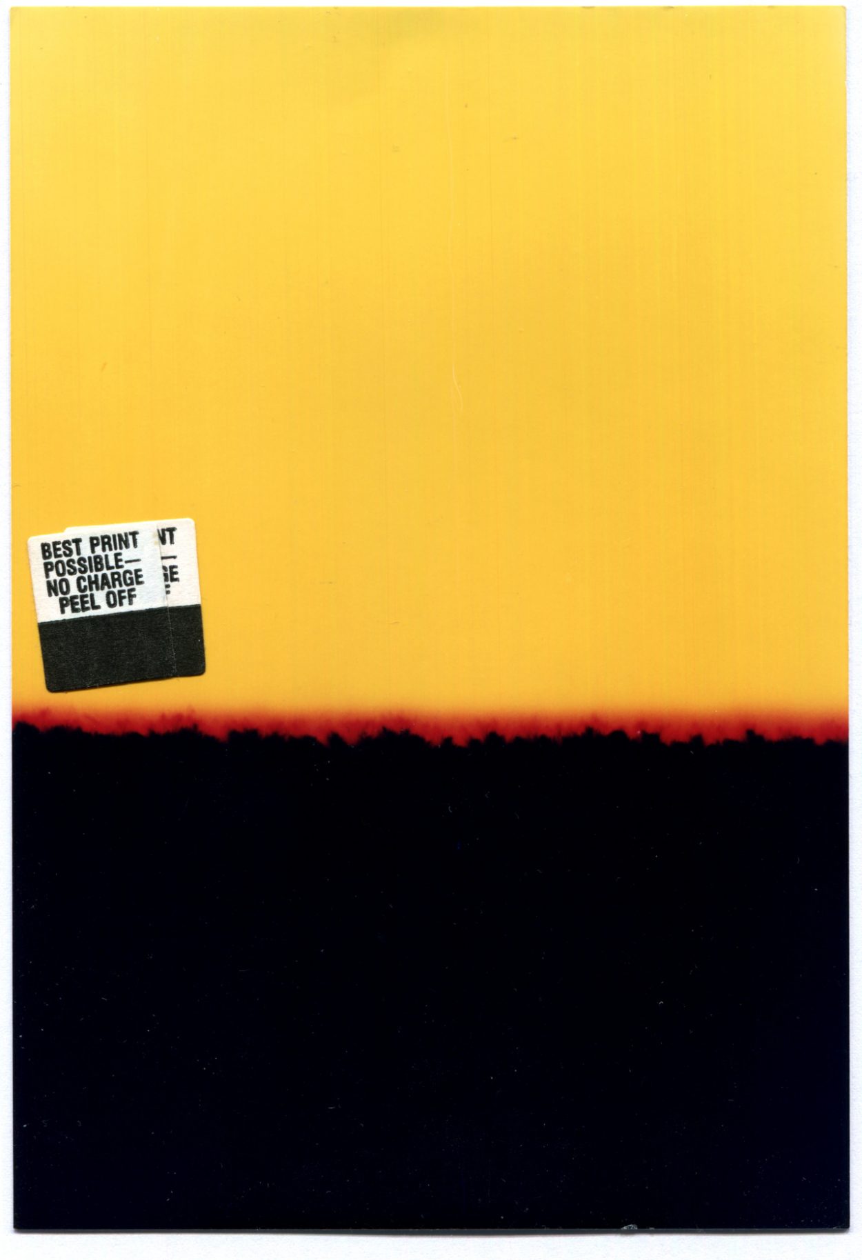
Best print possible, no charge
Published

Published
Published
Published
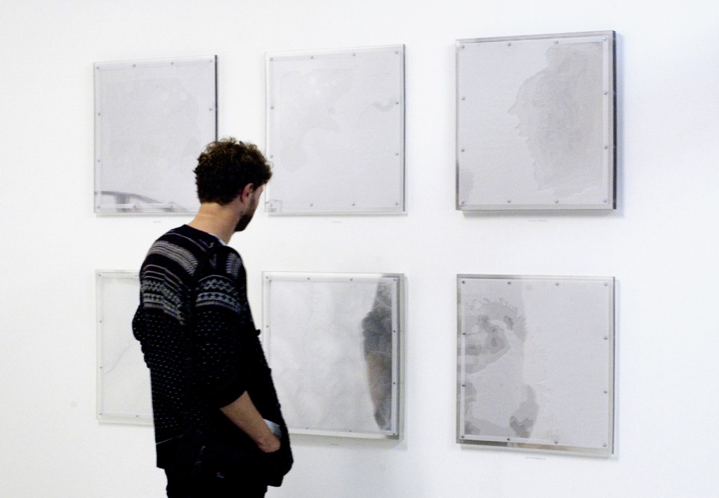
Topographies is a series of cut-paper compositions. Each layer is sandwiched between 540 × 540mm sheets of 10mm perspex. The photo above is from the 2011 postgraduate degree show at Byam Shaw School of Art (Central Saint Martins, London).
I love them, but they are very heavy and unwieldy. There are a few remaining, get in touch if interested.
Published
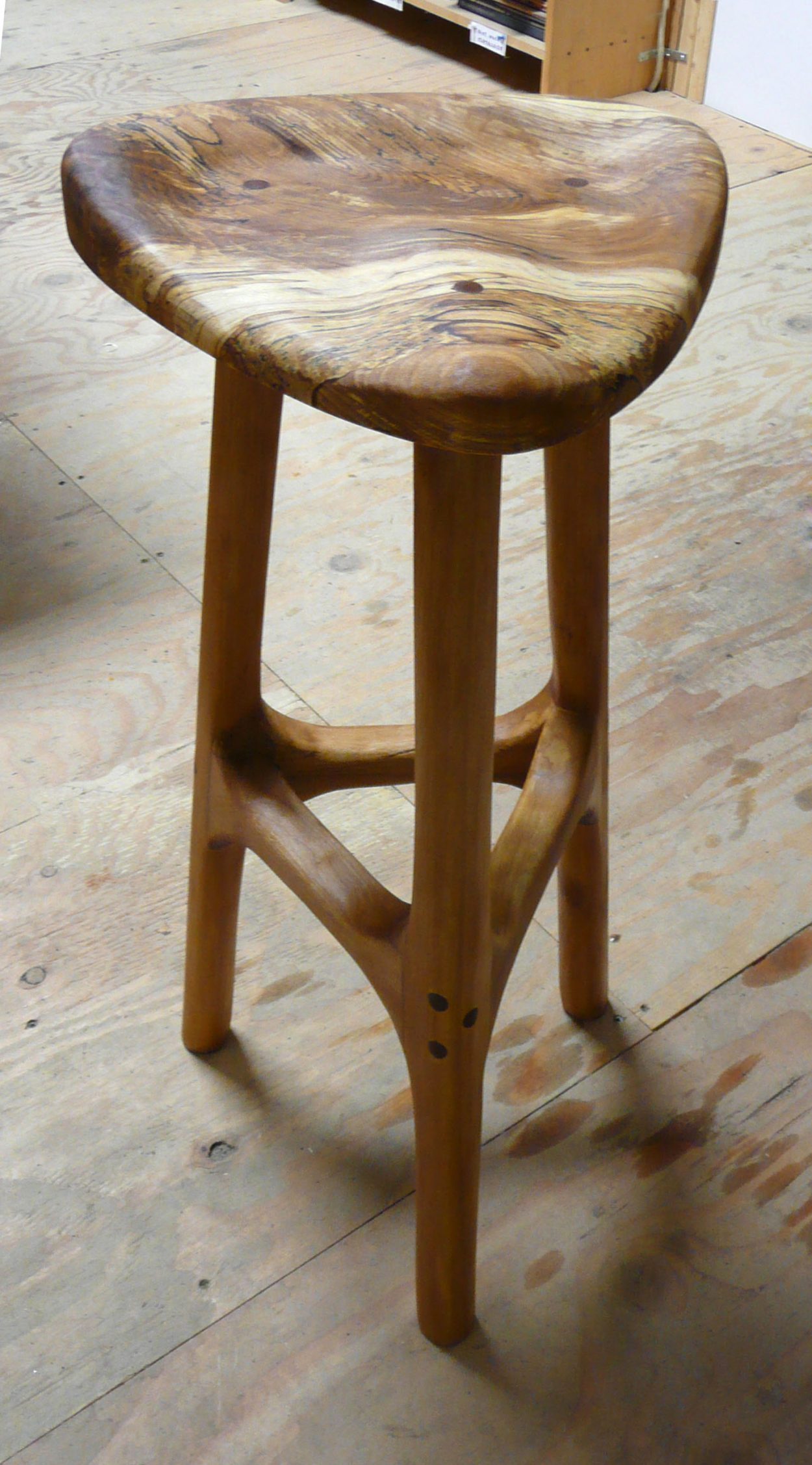
Twenty-eight inch tall beechwood stool w/ spalted seat in the workshop, January 2010. Not the best photo unfortunately.
Published
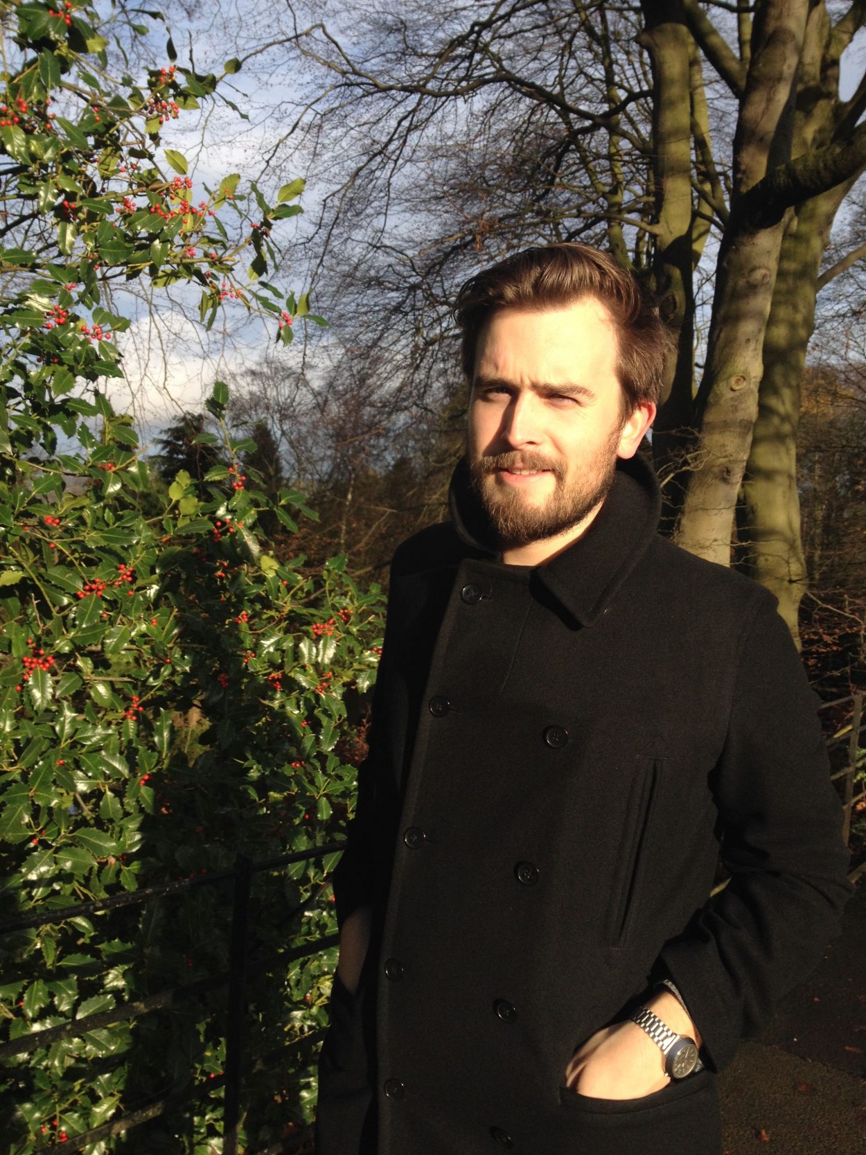
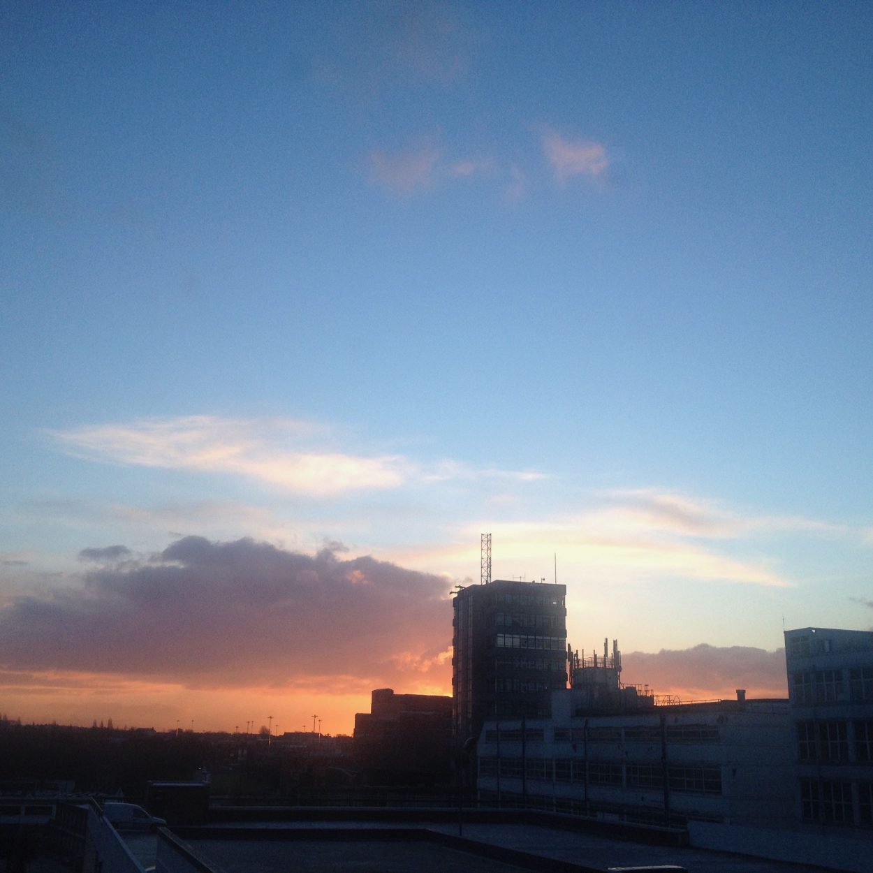
Post-Thanksgiving walk, just before the sun sets behind the moor
Published
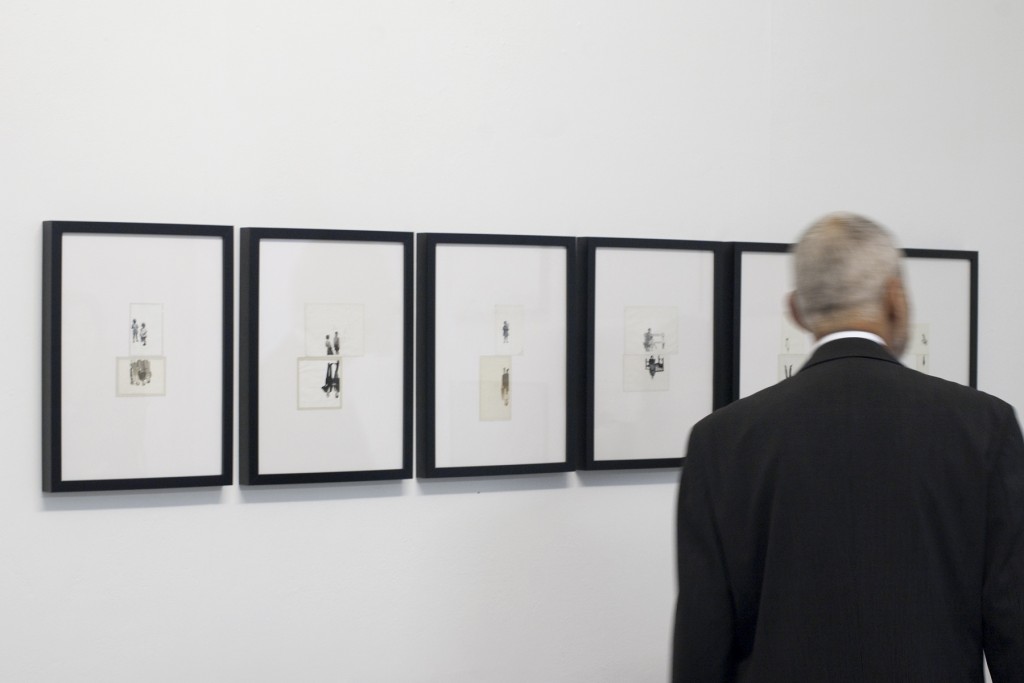
Before & After is an ongoing series of paired, altered photographs. The photo above shows is six iterations from this series that were included at the “Cross Over” exhibition at the Lethaby Gallery (Central Saint Martins, London). This work was shortlisted for the 2011 Nova Awards.
Published
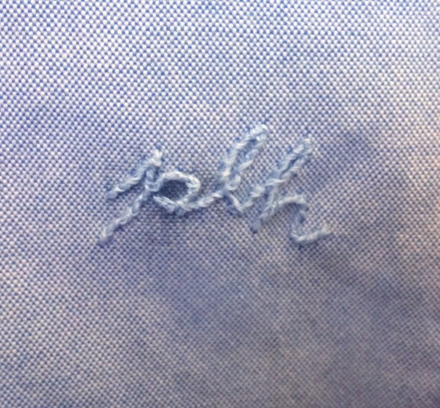
A quick-ish disguise for a 5p/dime-sized permanent pen stain on my shirt. Blends in a little bit more than before.
Published
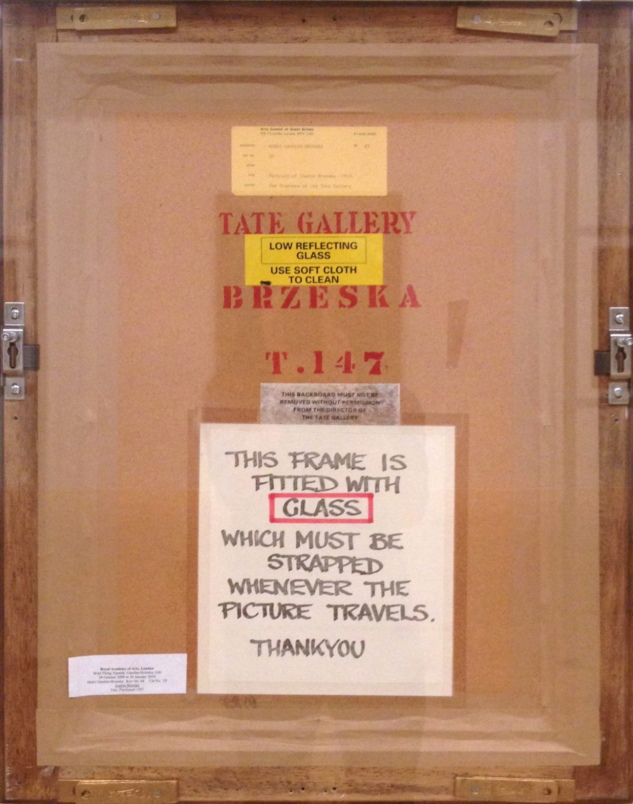
The back of a piece by Henri Gaudier-Brzeska at the Tate Liverpool as part of the DLA Piper Series: Constellations. Neat to see the backs of some major artists’ work. Remember: MUST BE STRAPPED.
Published

Another favourite part of the 2014 Liverpool Biennial, Claude Parent’s La colline de l’art in the Wolfson Gallery on the ground floor at the Tate Liverpool.
Particularly enjoyed the way the light was diffused and altered for works with very reflective surfaces or cases.
I really enjoyed Liechtenstein’s Moonscape, a screenprint on iridescent blue plastic. It seemed smaller and more experimental than his more famous pieces, and more reserved. You walk up a long ramp in Parent’s space to reach the piece and end up viewing it on a raised platform, a dead-end and the highest point in the gallery. That’s where I took the iffy panorama above. The photo doesn’t do it justice, but hopefully it gives an impression of the extent of Parent’s architectural intervention within the space.