Published

Reflections on running a self-hosted personal site in the year two thousand twenty-six

Yet again, a long drought between my last post and this one. Unusual for me in the reasonably recent past, now a common occurrence. I keep asking myself “why?”, why am I not posting as much when I loved it so much before?

Edit: Wow… I just realized my last post was almost a year ago.

While recently troubleshooting some bonkers bad bot traffic on an org website that I help maintain, I finally realized: It is getting a lot harder to maintain a self-hosted personal site. I’m seeing all of the same problems that org site is seeing, just at a slightly smaller scale and with less visibility since I haven’t had client-side analytics since late 2020.

Picture the scene.

Read more

Published

How and why I stopped freelancing

A quick disclaimer: This is NOT an article about how to find a full-time job. There are a million posts about that online. And anyways, beyond the general advice1, I’m not sure how useful those articles usually are anyways. Every person’s path to a job is super different.

This is about the steps I took to make the transition from independent work to full-time employment as smooth as possible for my clients, my collaborators, my new employer, and most importantly myself. It’s also about the thought process behind that decision.

In many ways, this is all a long explanation of the feelings behind this earlier post.

It wasn’t without stress, but it worked out pretty well with a lot of prior planning and communication.


Wispy clouds against a blue sky

Before I go in to how, a little about why.

Read more

Published

My custom bash prompt

This is my custom bash prompt, as defined in my profile (~/.bash_profile). It includes a custom character for the prompt, the path, and the Git branch name (if any). The whole thing is colorful to make it a bit easier to identify the prompt in a sea of characters.

When I’m working on this WordPress theme for example, it looks sort of like this (RSS readers, you’ll miss the colors):

~/sites/commonplace-wp-theme (v0.1.5)

To generate something else, try messing around with the Bash $PS1 Generator.

If you want to try something like this, do not delete the rest of your profile. Just add this at the top.

# Get the Git branch
parse_git_branch() {
  git branch 2> /dev/null | sed -e '/^[^*]/d' -e 's/* \(.*\)/ (\1)/'
}

# Custom bash prompt
# Includes custom character for the prompt, the path, and Git branch name. With colors!
# Source: kirsle.net/wizards/ps1.html
export PS1="\n\[$(tput bold)\]\[$(tput setaf 5)\]➜ \[$(tput setaf 6)\]\w\[$(tput setaf 3)\]\$(parse_git_branch) \[$(tput sgr0)\]"

Note: I got this from someone else at some point… I’m trying to figure out who but haven’t gotten to the bottom of it.

Published

Fluid type sizes and spacing

I’ve been using a fluid type and spacing system on the most recent builds I’ve completed. Here’s why I use it, and how I approach it. I mainly use SCSS (a Sass syntax), but it’s also very do-able with plain CSS.

Screencast of Gort Scott’s homepage, resizing it in Chrome’s inspector

The example above demonstrates the result on gortscott.com, resizing the window from about 2300px down to about 640px and back again. The type and spacing across the page begins scaling down when the window is 2095px wide and stops shrinking at 1047px wide. At that point the text begins to reflow as the CSS Grid layout continues to shrink. Eventually at 703px wide the layout shifts, and again at 543px wide.

Read more

Published

4+ month update

It’s been a little over four months since B arrived. These are some of my experiences or things I’ve learned so far, plucked at random.

I’d say that the books, conversations, and classes prepared me pretty decently in theory, but the physical and emotional reality is almost impossible to prepare for. Being a parent has been much more visceral than I expected.

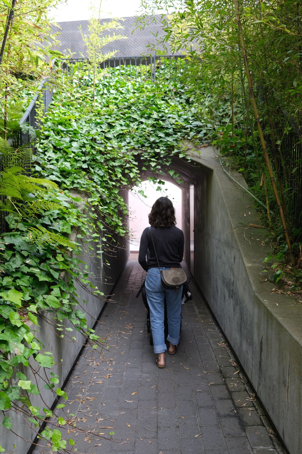
A woman walking in to James Turrell’s “Three Gems”

Read more

Published

Updates to v-fonts.com

I’ve been working with Nick Sherman on some updates to v-fonts.com, and he pushed the changes on Saturday. 🥳

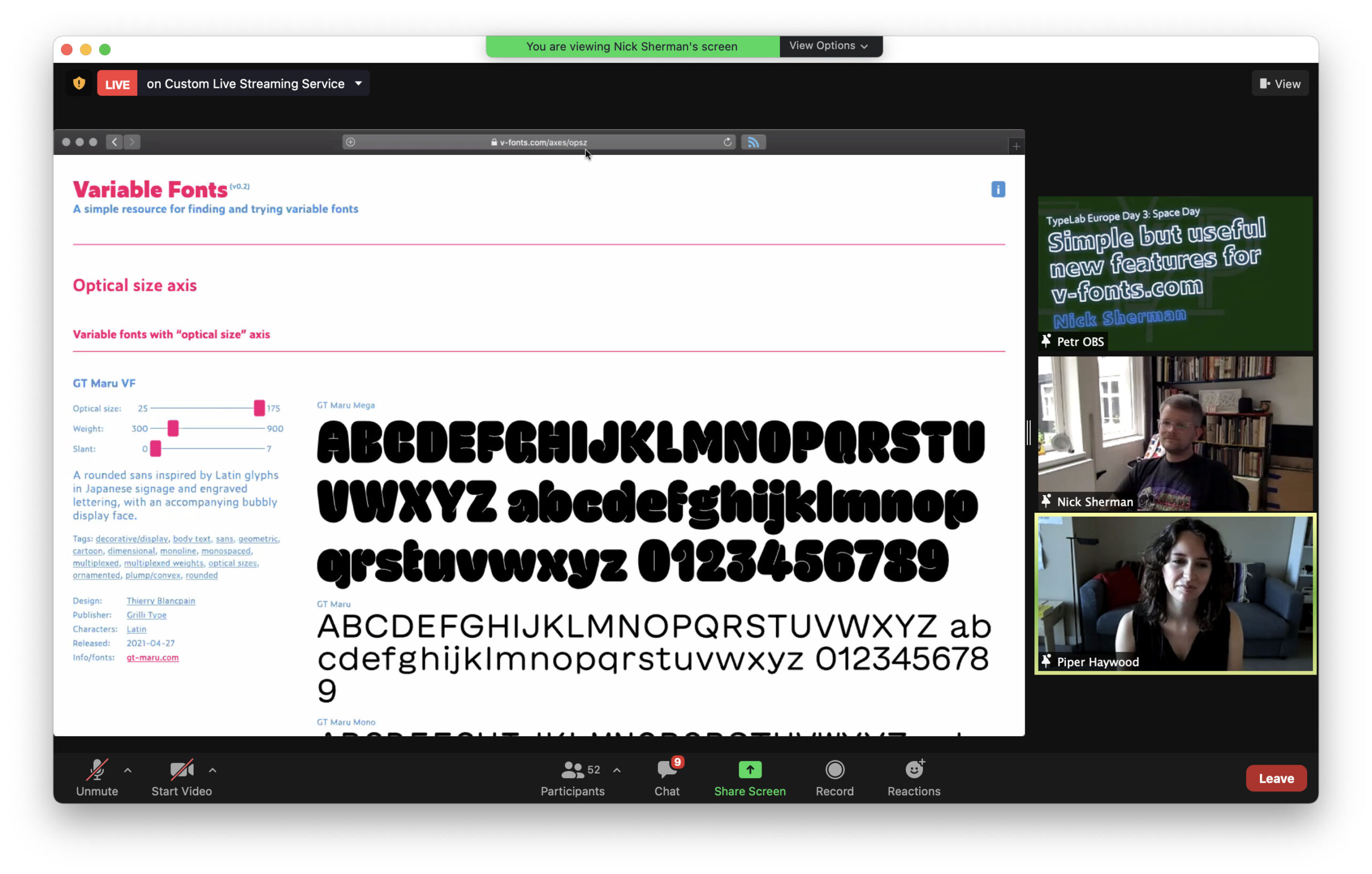
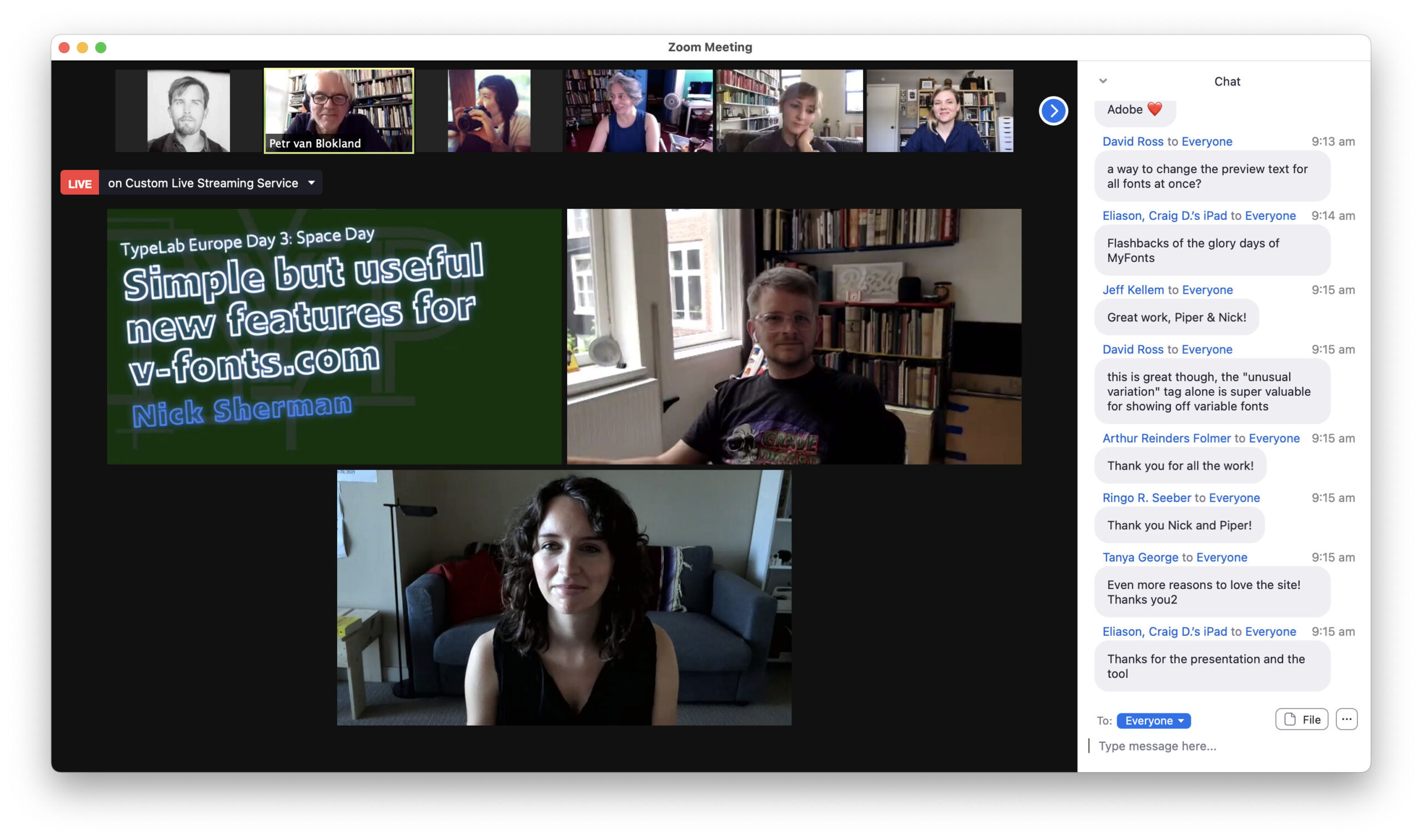
He managed to do it right before his TypeLab talk about these updates as part of Typographics 2021. He kindly invited me to join the talk, and it was a pleasure going through things together. Thank you to Petr Van Blokland for shifting things around so that I could contribute!

Screenshot from Nick Sherman and Piper Haywood’s talk about v-fonts.com as part of TypeLab

Screenshot from Nick Sherman and Piper Haywood’s talk about v-fonts.com as part of TypeLab

About the changes

For context/posterity:

Nick approached me about helping out with v-fonts.com after our back-and-forth about surface area-based logo sizing a little while back. I was pretty excited about the prospect since Nick’s a lovely guy, and I’ve found his Variable Fonts site so useful in the past!

The most major update is the introduction of term-based archives for tags (e.g. unusual variation or serif), designers (e.g. Elena Schneider), publishers (e.g. DJR), licenses (e.g. open source), and character sets (e.g. Cyrillic). These archive pages should make it a bit more straightforward to browse all of the listings, and they provide some useful context for the groupings. Nick has done phenomenal work curating it all.

Other updates include quantities to signpost how many results are returned and how many are left, better keyboard navigation for the sliders, and a RSS feed (yay!!). If RSS is your thing, you can find the link in the site footer.

There’s a lot more we’d like to do though.

For the future

A few enhancements for later down the line:

  • Automated content creation; we could potentially extract some data from the font files to speed up content editing/uploading; the Wakamai Fondue repo on GitHub by Roel Nieskens will no doubt be an invaluable resource for this!
  • Enhanced preview capability; would be nice to change the preview text and the size of the text
  • Automated font preview images for RSS

Things we’d like to get to sooner 🤞 include:

  • Filtering by axis (weight, slant, etc.); this sort of exists currently (see one of the screenshots above for an example), but we can’t really expose it yet due to some limitations
  • Prettier URLs for tags, with automated redirects from the old URLs
  • Sorting capability by things like the date the font was updated or alphabetical by title
  • Multi-dimensional filtering; would be nice to look at all of the serif fonts with extended Latin support that offer a trial, or check out all of the open source variable fonts published by Arrow Type, for example
  • Search!

We didn’t end up including these changes because we hit a few walls with the ExpressionEngine set up. EE is a great CMS, but unfortunately it doesn’t seem to give us quite enough control out-of-the-box for the more extended functionality we’re after. I explored add-ons and such for some of these things, but it quickly felt like too scrappy/hacky when there are other CMS options out there that would allow us to achieve this more maintainably.

So the next big step will likely be migrating to a different CMS. Big task (code, content, URL redirecting, etc.), but do-able! At the moment, I’m eyeing Craft CMS + the Feed Me plugin by the Craft developers for semi-automated content migration.

But it will be a few months before I take a look at it due to maternity leave coming up so soon, so we’ll evaluate the best CMS for the job then. I don’t expect a better CMS option for this particular project to come up between now and then but you never know, these things can move so fast!

Thanks for the screenshots, SB!

Published

How to make a Rietveld-esque crate stool / table

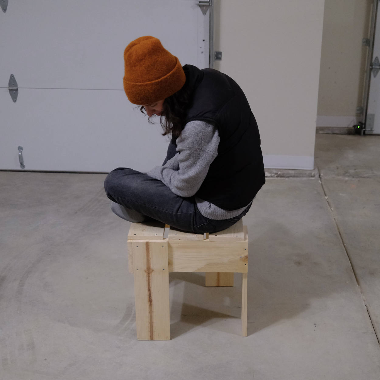
A woman in an orange beanie sitting on a pine stool made in Rietveld’s crate style

In late February, we made a stool based on Gerrit Rietveld’s kratkrukje or “crate stool” designed in the mid 1930s. Skip to the instructions, or skip to the cut list and plans.

We’d been looking for something that could act as stool-cum-sidetable for a little while. Haven’t had any luck with secondhand or antique shops, everything we found was too ornate, large, cushion-y, or expensive. And while we’re fine with the idea of buying something from Ikea or a similar store, nothing we found felt quite right. Also, the thought of wandering through Ikea at the moment made us a bit anxious.

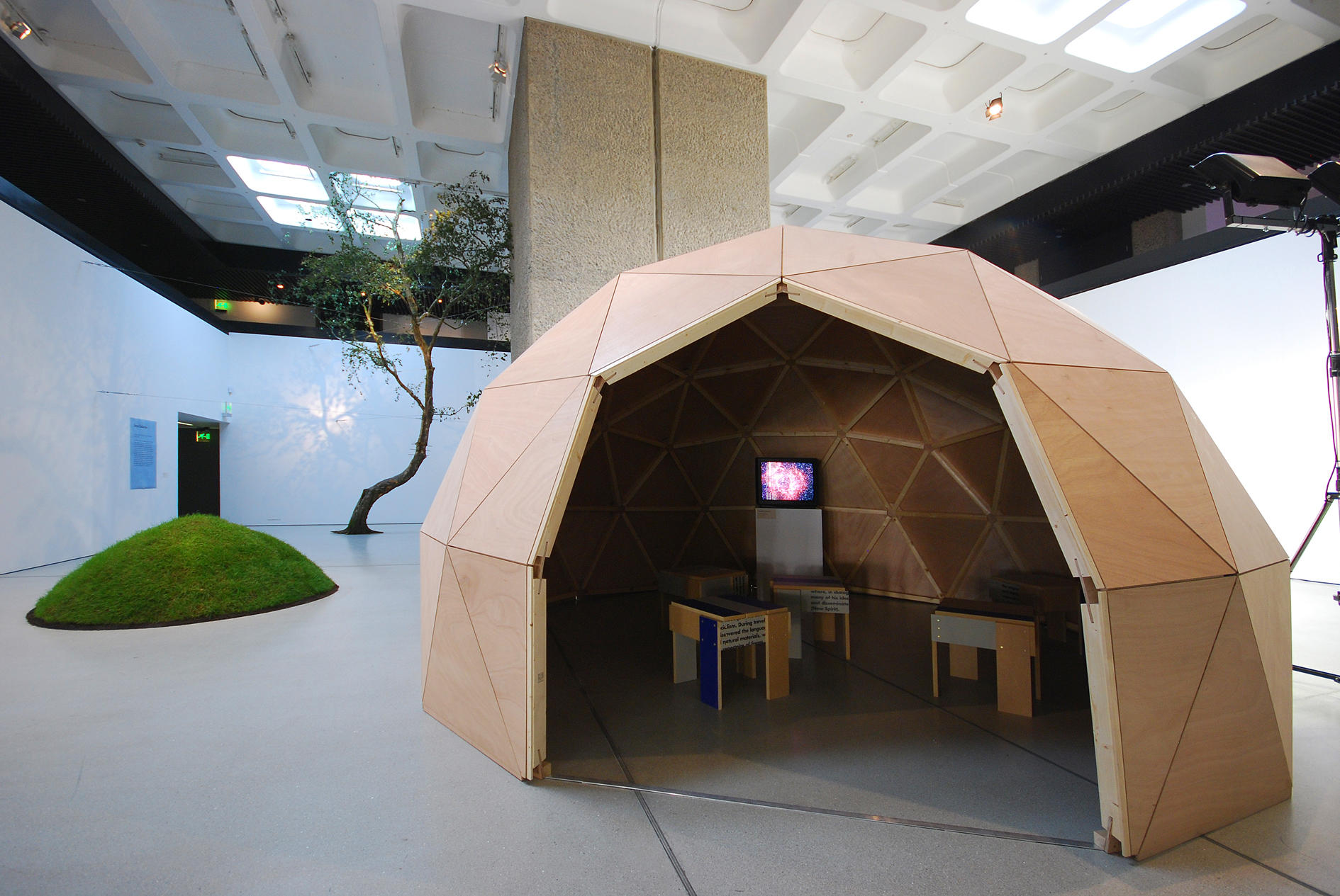
So having had success with Enzo Mari’s Autoprogettazione in the past and buoyed by Hannah’s Rietveld crate chair success last summer, we decided to go down the DIY route. Rietveld’s crate stools have been on Sam’s mind since he saw them in the Radical Nature exhibition designed by Sara De Bondt at the Barbican back in 2009. Those stools were created by Simon Jones of Jones Neville by reusing and cutting down old exhibition panels.

There are a bunch of Rietveld crate furniture photos and designs knocking around the world wide web, but very little relating to this specific stool as far as I can tell. I have a feeling that it wasn’t included in the bilingual book How To Construct Rietveld Furniture, but can’t be sure since I don’t own it.

At any rate, there are a few photos online including this photo from Bibliotheek Rotterdam, this blog post, and a photo of the stools in situ at the Radical Nature exhibition.

According to Bibliotheek Rotterdam:

This stool is known to exist in several sizes. Metz & Co. also sold a table similar to this design. According to Gerrit Rietveld’s son, Jan Rietveld, both the Rietveld and Schröder families were involved at one time or another in producing and selling Crate Furniture.

Since we couldn’t find plans for the stool, we made our own based on the photos mentioned above. We didn’t have scraps to reuse as Jones so elegantly did, so we ended up buying three 1″ × 6″ × 6′ whitewood boards and basing our plans on the most economical use of that lumber.

It’s definitely a bit more expensive than a KYRRE stool from Ikea, the materials were a little over $30 in total and of course there’s the labor. We did this in a few hours over the course of a few days, but it probably took us longer than it would normally because we were working out the process and tweaking our initial plans as we went. All-in-all it was worth it. It’s a satisfying little lump of furniture.

Here are the steps to make one for yourself.

Read more

Published

Now online: Open-weather

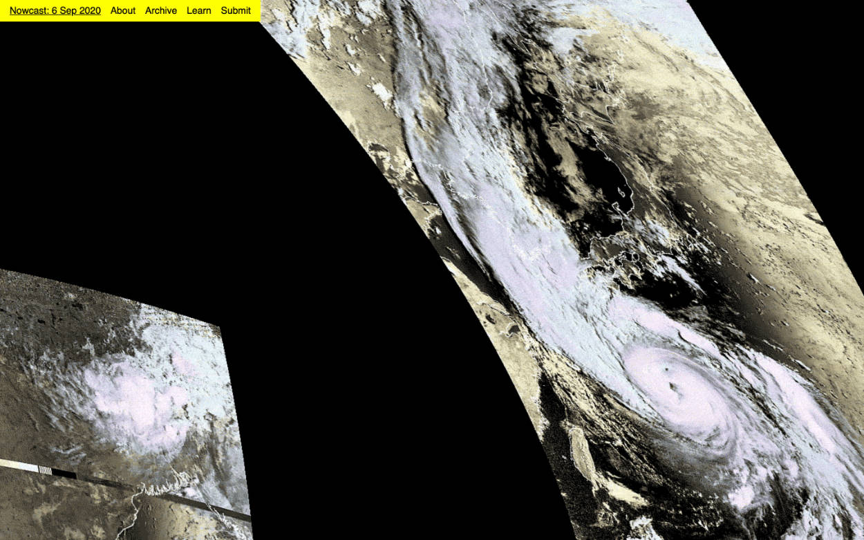
Screenshot of the Open-weather website showing a storm over Japan

open-weather.community

The Open-weather website is online. A bit about Open-weather:

Open-weather is a project by Sophie Dyer and Sasha Engelmann probing the noisy relationships between bodies, atmospheres and weather systems through experiments in amateur radio, open data and feminist tactics of sensing and séance.

The site is pretty straightforward, a static hub for a bunch of resources hosted in various places including their PublicLab wiki and archive of amateur radio-generated weather data. The homepage is currently a large scrollable nowcast produced in collaboration by people across the globe. We decided to embed the Google Sheet archive directly in the site for now, though that may change in the future. We may do the same for pages such as methodology, to come later on. We’ll see!

The site is hosted on Netlify and the code is in a GitLab repo. Pls excuse sub-par commit messages and the very minimal README.

Sasha and Sophie are giving a talk at 14:30 UTC-4 Toronto as part of Our Networks distributed festival. Definitely worth grabbing a ticket, it’s super well priced considering how much Our Networks is putting on and absolutely worth supporting that org.