Published
A couple

Highlights, the important stuff. Things that I’ve written or posted about and want to draw particular attention to. Might be a personal win, a terrible event, a beautiful moment. Allsorts. Follow via RSS.
Published
Published
Certain quotes lodge themselves in your head. So many of the ones in my head come from the fourth edition of What is a designer by Norman Potter published by Hyphen Press in 2002.
p.23, on design education
The words by which people describe themselves – architect, graphic designer, interior designer, etc. – become curiously more important than the work they actually do. In one respect this is fair, because under modern conditions it may be very difficult to find one word to identify their work, but such words tend to build up irrelevant overtones of meaning which are more useful as a comfort to personal security than as a basis for co-operative enterprise.
p.30, wrapping up his thoughts on design education
All we can do is make good work possible, and be alert to its coming; never fooling ourselves that all good things come easily. To work well is to work with love.
p.57, on recognising the value in nuance
In raising consciousness of these matters, it should be remembered that our civilization sells itself through sensation, preferably with the volume turned up. This is good reason for designers to learn how to speak quietly, and to understand how it is that conversation becomes possible between people and things.
And nearly every point in chapter 18, “Advice for beginners”, and 19, “Questioning design”.
Published
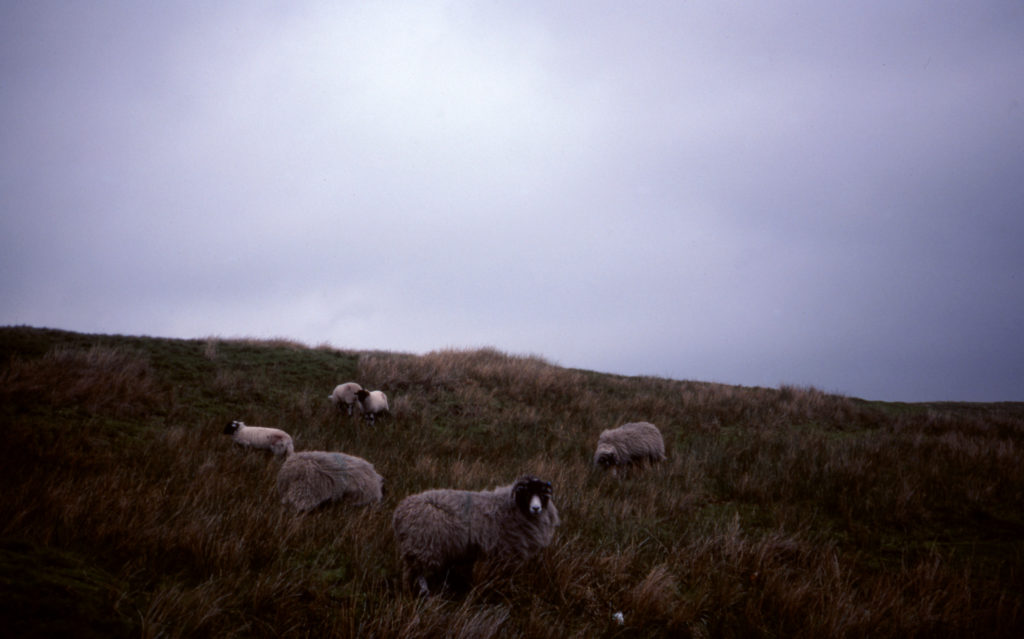
Yesterday, Claire and Tom finished their first marathon with mountains, Mike his 23rd. Exceptionally well done! Photo above was taken by Grandma and Grandpa Piper in the Yorkshire Dales on a trip around northern England and Scotland in the mid-90s.
Published
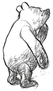
Winnie the Pooh by A.A. Milne and illustrated by E.H. Shepard, on YouTube
Published
To be “always in discovery mode”, to “carry with us no rigid ideas about what is interesting”, to consider the “worthwhile dilemmas”. How to cultivate the time and space for a discovery state of mind? The tools must be personal, and natural.
Published
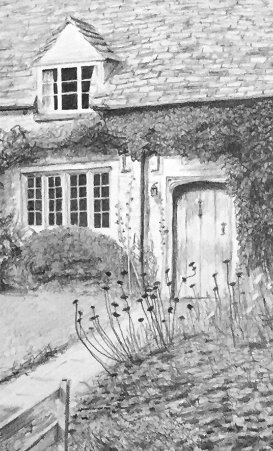
Detail from a graphite drawing completed late last year
Published
Did some research on Chinese web font best practices a while back when working on Memory Machine for Tyler Coburn + Asia Art Archive with Luke Gould. It was an interesting challenge. This was my overall takeaway from the research:
Published

Sunnier times and climes.
Published

Published
