Published

“Kill your personas”

Counterpoint to yesterday’s post: “Kill your personas: How persona spectrums champion real user needs” by Margaret Price at Microsoft.

A persona spectrum is not a fake person. It’s an articulation of a specific human motivation and the ways it’s shared across multiple groups. It shows how that motivation can change depending on context. Sometimes, a trait can be permanent, like someone who has been blind since birth. A person recovering from eye surgery might temporarily have limited or no vision. Another person might face this barrier in certain environments, like when dealing with screen glare out in the sun. How would your product adapt to this range of people and circumstances with similar needs?

I can get behind that!

Related, check out Microsoft’s Inclusive Design Toolkit. (Though I reeeeeally wish that were a webpage…)

Via Doug Belshaw’s “Temporarily Abled” article on Thought Shrapnel.

Published

GDS’s Accessibility Personas

If you’re a designer or engineer and have never dug in to accessibility personas or cognitive walkthroughs before, I’d recommend checking out GDS’s accessibility persona homepages and their accompanying blog post about how they use persona profiles to test accessibility. As of right now, their profiles include the following personas:

  • Claudia – a sight impaired screen magnifier user
  • Ashleigh – a severely sight impaired screenreader user
  • Ron – an older user with multiple conditions
  • Chris – a user with rheumatoid arthritis
  • Pawel – an autistic user
  • Simone – a dyslexic user
  • Saleem – a profoundly deaf user

It’s no substitute for testing with real users, but it’s a big step in the right direction if it’s not already a part of your design and engineering process.

Published

Why can’t you show AM/PM time on an iPhone?

So apparently you can’t set your iPhone to show AM and PM alongside the 12-hour time. This may not seem like a big deal, but I think it’s a pretty significant accessibility issue.

My grandpa is 100 years old, we just celebrated his birthday in March. He’s doing pretty darn well for his age. The only thing he’s having trouble with is short-term memory. This usually isn’t a big enough problem to cause any major concern at the moment. Although he lives on his own, it’s in an apartment that is equipped for his needs within an assisted living building, and my parents aren’t too far from him.

The thing that is causing problems, pretty major problems, is when he takes a nap and then wakes up and thinks it’s the wrong time of day. This causes him to miss meals because he doesn’t go down to the dining room in time. And when older folks start to regularly miss meals, they get pretty weak pretty fast.

He doesn’t want to cause a fuss, so we don’t know exactly how often this happens. I imagine with other folks, it also might be a bit embarrassing (maybe it is for him as well, I’m not sure). He naps a lot, which is fair enough considering his age, so I suspect it might be more often than we think.

I was talking about this with my mom, asking him if he has a big digital clock in his apartment or something. He does have a clock, but he usually looks at his watch or his phone for the time. I don’t want to suggest that he wear a digital watch, because his watch came from my grandma. So we were looking at our phones, and she pointed out that there’s no AM/PM.

There’s no way of changing it! That seems ludicrous.

I know he could change it to 24-hr time. But I doubt he would do that, because he would probably convince himself that it’s fine and he doesn’t need it. It would be a heck of a lot easier if you could just show AM/PM via the iOS Date & Time settings, as one would expect.

If any Apple folks happen to read this, I’d love if you could take this feedback onboard in some way. Or if you happen to know anyone at Apple, I’d really appreciate if you shared this with them.

In the meantime… I guess we get him a bigger digital clock for his apartment? I’m really not sure.

Published

READING LIST from the Glasgow Women’s Library

Graphic designers Kaisa Lassinaro and Maeve Redmond have designed READING LIST, a series of t-shirts that reference books, which they have selected, from the Glasgow Women’s Library catalogue. All of these books (and many more!) are free to borrow from Glasgow Women’s Library.

So the Reading List t-shirts are really cool, but I would feel like an absolute phony buying one without having read the books. One of them I’m on top of, I have A Room of One’s Own on my nightstand. BW, sorry it has taken me approximately a million years to get round to reading it. But here’s the full list to work through, nonfiction and fiction (including a bit of speculative sci fi!), from oldest to most recent.

  • A Room of One’s Own by Virginia Woolf, 1929
  • Sisterhood Is Powerful Ed. Robin Morgan, 1970
  • The Driver’s Seat by Muriel Spark, 1970
  • Woman on the Edge of Time by Marge Piercy, 1976
  • The Living Mountain by Nan Shepherd, 1977
  • Our Bodies Ourselves by Boston Women’s Health Book Collective, 1978
  • The Politics of Housework Ed. Ellen Malos, 1980
  • The Color Purple by Alice Walker, 1982
  • Gender Trouble by Judith Butler, 1990
  • How To Be Both by Ali Smith, 2014

And how cool is the Glasgow Women’s Library? It’s “the only Accredited Museum in the UK dedicated to women’s lives, histories and achievements”. Neat.

Thx, SB, for sharing this with me.

Published

Fluid type sizes and spacing

I’ve been using a fluid type and spacing system on the most recent builds I’ve completed. Here’s why I use it, and how I approach it. I mainly use SCSS (a Sass syntax), but it’s also very do-able with plain CSS.

Screencast of Gort Scott’s homepage, resizing it in Chrome’s inspector

The example above demonstrates the result on gortscott.com, resizing the window from about 2300px down to about 640px and back again. The type and spacing across the page begins scaling down when the window is 2095px wide and stops shrinking at 1047px wide. At that point the text begins to reflow as the CSS Grid layout continues to shrink. Eventually at 703px wide the layout shifts, and again at 543px wide.

Read more

Published

An endless loop

Just finished the article “Ontological Design Has Become Influential In Design Academia – But What Is It?” by JP Hartnett for AIGA Eye on Design, via the Feminist Open Source Investigations Group chat.

This is somewhat related to the previous post, the “we are our experiences” concept. But much more formal than my ramblings, better philosophical underpinnings for sure!

I’d heard of ontological design but hadn’t really dug in to it. This article is a useful dive in.

In very few words (specifically professor of design theory Anne-Marie Willis’s words, not mine): “Design designs us”. In more words, from Hartnett’s article:

A human being cannot exist independently of its surrounding environment — it is not possible to be without being-in-the-world. Being, then, is always relational: with everything that surrounds us, including the full complexity of the completely designed worlds that we inhabit. This point is crucial for ontological design theorists: design doesn’t just perform certain functions — a car transports you from A to B, a poster displays information, etc. — the interrelated totality of designs construct the world through which humans are brought into being and come to be defined through. Human beings, in turn, design the world, which, in turn, designs them… and so on. The process is circular, like an endless loop.

And on the consequences of embracing ontological design in practice instead of relegating it to theory and academia:

One welcome outcome of an embrace of ontological design theory would be the death of the individualism that has plagued the design profession — “iconic” designs, individual designers, celebrated in isolation as they usually are in design publications — don’t make any sense in this context.

That would be welcome indeed.

I don’t quite see how it can happen unless there is a true revolution in the way we talk and think about design—more holistic and less about singular problems, more collective and less individual—but maybe circumstances are ripening for such a change.

Published

A little more on Rietveld’s crate furniture, discovering Louise Brigham’s earlier box furniture, and thoughts about the purpose of a blog

More on Rietveld’s crate furniture

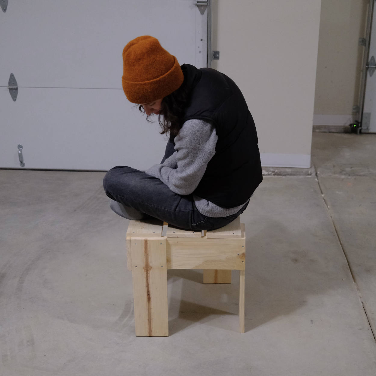
Off the back of writing up the Rietveld-esque crate stool how-to, I started looking in to more about the origins of Gerrit Rietveld’s crate furniture. The best write up I’ve found is “A restorer’s blog: Pre-war crate desk by Rietveld”. It sounds like Metz & Co, the company selling much of Rietveld’s furniture, was skeptical.

“We cannot sell wood chips,” director Joseph de Leeuw had written to Rietveld.

It’s worth reading the post in full for a ton of anecdotes and context, as well as some useful comments from a master furniture restorer.

Louise Brigham’s earlier box furniture

While researching, I also came across this post which introduced me to Louise Brigham, an American designer and teacher best known for her box furniture.

Her background is one of privilege, but she seemed to wield her privilege reasonably well. She came from a comfortably wealthy Bostonian family, and her parents died in her teens. Their death, combined with family wealth, likely allowed her to buck the normal pressures on a woman living in her time. She instead pursued her creative and social ambitions.

After studying both the Pratt Institute and the Chase School of Art (now Parsons), she became involved in the settlement house movement in Cleveland, OH where she experimented with furniture made from boxes and crates. She then travelled around Europe studying craft traditions. Supposedly she visited Charles Rennie Mackintosh and Margaret Macdonald Mackintosh in Glasgow, which I feel you can see in some of her designs. Perhaps her most impactful time was spent in Spitzbergen, a treeless island that is part of the Svalbard archipelago in the Arctic where she really honed her design rational, ethos, and aesthetics.

She was prolific in the early 1900s. In 1909—over two decades before Rietveld’s crate furniture—she published Box Furniture, a book charmingly illustrated by Edward Aschermann on how to make furniture from crates. The book was reprinted multiple times and translated in to many languages.

To all who care for simplicity and thrift, utility and beauty, I send my message.

Louise Brigham, Box Furniture, p25

In the early 1910s, she set up a woodworking “laboratory” for children called the Home Thrift Association. During WWI she started one of the earliest ready-to-assemble furniture companies, Home Art Masters.

Why haven’t we heard more about her work?

For further reading on Louise Brigham, there are a few articles and books out there that look worthwhile. The interiordesign.net article “Thinking Outside the Box: Louise Brigham’s Furniture of 1909” by Larry Weinberg published in 2009 provides a lovely introduction to Brigham and her book. See also Kevin Adkisson’s paper “Box Furniture: Thinking Outside the Box” from 2014 for much more detail on her, including her later life.

The most extensive writing on Brigham currently appears to be Antoinette LaFarge’s book Louise Brigham and the Early History of Sustainable Furniture Design. I haven’t read it, but it looks promising.

And of course, check out Brigham’s Box Furniture available to view or download for free on archive.org. Love it, this book being part of the Internet Archive feels very in keeping with her vibe.

I’m planning to dig in a bit to Alice Rawsthorn’s writing. Her short article on Brigham for Maharam prompted me to look at her other articles. The list is extensive. Looking at that list, she seems to have covered so many of the women I have had some major or minor curiosity about over the past few years. See her writing on Louise Brigham, Ruth Asawa and the Alvarado School Arts Workshop in San Francisco, architect and designer Charlotte Perriand, architect Sophie Hicks and her home, Lucie Rie and her buttons, furniture and interior designer Clara Porset, Bauhaus photographer Gertrud Arndt, architect Jane Drew, interior designers Agnes and Rhoda Garrett, architect and activist Grete Lihotzky. I think I need to pick up a copy of Rawsthorn’s Design as an Attitude or Hello World: Where Design Meets Life at this point.

On a more personal note, I identified strongly with Rawsthorn’s short article on her most treasured possession for Elle Decoration. My most treasured possessions from my maternal grandmother are cookbooks and kitchen tools. Her battered plastic cake stand, a perfectly shaped spatula, a muffin tin. From her mother, it’s her quilt patterns cut from scrap cardboard and cereal boxes, and her flower drawings for embroidery. This is not to say that I don’t also cherish more traditionally precious heirlooms, it’s just that the objects with utility feel like they maybe have more of the life of the person in them.

Some thoughts after reading Didion’s “On Keeping a Notebook”

I finally read Joan Didion’s “On Keeping a Notebook”. I was reminded of it yet again while surfing around the web looking at all of the above and found a copy online.

Keepers of private notebooks are a differ­ent breed altogether, lonely and resistant rearrangers of things, anxious malcontents, children afflicted apparently at birth with some presentiment of loss.

Harsh. But probably fair.

See enough and write it down, I tell myself, and then some morning when the world seems drained of wonder, some day when I am only going through the motions of doing what I am supposed to do, which is write—on that bankrupt morning I will simply open my notebook and there it will all be, a forgotten account with accumulated interest, paid passage back to the world out there […]

Exactly.

We are not talk­ing here about the kind of notebook that is patently for public consump­tion, a structural conceit for binding together a series of graceful pensées; we are talking about something private, about bits of the mind’s string too short to use, an indiscriminate and erratic assemblage with meaning only for its maker.

Now this is interesting, and it sort of hits on the difference between a personal blog and a blog that feels more business-driven.

The best personal blogs I’ve come across feel like a glimpse in to someone’s personal notebook, something filled mostly with notes written with the author in mind first and foremost vs notes that have been written with a wider audience in mind. A good personal blog can (and maybe should) contain a mixture of both, since they both can be absolutely great and useful. But when it is only ever writing for an audience… well that doesn’t feel like a personal blog, to me.

It all comes back. Perhaps it is difficult to see the value in having one’s self back in that kind of mood, but I do see it; I think we are well advised to keep on nodding terms with the people we used to be whether we find them attractive company or not. Otherwise they turn up unannounced and surprise us, come hammering on the mind’s door at 4 a.m. of a bad night and demand to know who deserted them, who betrayed them, who is going to make amends. We forget all too soon the things we thought we could never forget.

“It all” being moments, memories, the good and the bad.

I hope to have this site when I’m 80. I may not like some of the things I wrote 50 years prior, but at least I will be able to reacquaint myself with former me-s. I hope I don’t lose sight of this purpose.

And we are all on our own when it comes to keeping those lines open to ourselves: your notebook will never help me, nor mine you.

A difference between Didion’s era and now: some of my notes could help you, and yours me. Another reason that I love personal blogs. It just seems so hard to find them sometimes.

A notebook, that’s all any of this is, really.


Edited 10 May, changed “like a personal brand exercise” to “more business-driven”. The phrase “personal brand” has a lot of negative connotations, so “personal brand exercise” felt way too snarky on a re-read. Business-driven blogs by individuals are super important, and useful! They’re just different, and there’s space for all of that (and a mixture of all the above) online.

Published

How to make a Rietveld-esque crate stool / table

A woman in an orange beanie sitting on a pine stool made in Rietveld’s crate style

In late February, we made a stool based on Gerrit Rietveld’s kratkrukje or “crate stool” designed in the mid 1930s. Skip to the instructions, or skip to the cut list and plans.

We’d been looking for something that could act as stool-cum-sidetable for a little while. Haven’t had any luck with secondhand or antique shops, everything we found was too ornate, large, cushion-y, or expensive. And while we’re fine with the idea of buying something from Ikea or a similar store, nothing we found felt quite right. Also, the thought of wandering through Ikea at the moment made us a bit anxious.

So having had success with Enzo Mari’s Autoprogettazione in the past and buoyed by Hannah’s Rietveld crate chair success last summer, we decided to go down the DIY route. Rietveld’s crate stools have been on Sam’s mind since he saw them in the Radical Nature exhibition designed by Sara De Bondt at the Barbican back in 2009. Those stools were created by Simon Jones of Jones Neville by reusing and cutting down old exhibition panels.

There are a bunch of Rietveld crate furniture photos and designs knocking around the world wide web, but very little relating to this specific stool as far as I can tell. I have a feeling that it wasn’t included in the bilingual book How To Construct Rietveld Furniture, but can’t be sure since I don’t own it.

At any rate, there are a few photos online including this photo from Bibliotheek Rotterdam, this blog post, and a photo of the stools in situ at the Radical Nature exhibition.

According to Bibliotheek Rotterdam:

This stool is known to exist in several sizes. Metz & Co. also sold a table similar to this design. According to Gerrit Rietveld’s son, Jan Rietveld, both the Rietveld and Schröder families were involved at one time or another in producing and selling Crate Furniture.

Since we couldn’t find plans for the stool, we made our own based on the photos mentioned above. We didn’t have scraps to reuse as Jones so elegantly did, so we ended up buying three 1″ × 6″ × 6′ whitewood boards and basing our plans on the most economical use of that lumber.

It’s definitely a bit more expensive than a KYRRE stool from Ikea, the materials were a little over $30 in total and of course there’s the labor. We did this in a few hours over the course of a few days, but it probably took us longer than it would normally because we were working out the process and tweaking our initial plans as we went. All-in-all it was worth it. It’s a satisfying little lump of furniture.

Here are the steps to make one for yourself.

Read more

Published

Decentering Whiteness in Design History, an annotated bibliography in progress

Check out Decentering Whiteness in Design History, an annotated bibliography in progress.

One of the great FemOS ladies shared the above resource recently. She came across it via the Simply Secure Slack chat. It seems like a strong doc, I hope that the researchers and others continue to add to it.

If you’re looking for resources on a particular topic like typography or graphic design, it’s best to refer to their hashtag list currently on page 8 (search the doc for “Hashtag Authority List” if it moves). Then find a tag you’re interested in and search the doc for that tag.

Below is a list of a few resources that caught my eye and I’d like to follow up on. These are all freely available online in one form or another or could likely be loaned from a library.

  • “The Font that Never Was: Linotype and the “Phonetic Chinese Alphabet” of 1921”, an article by Thomas S. Mullaney. The article is behind a paywall, but he also presented it at ATypI 2016 (see video).
  • Saki Mafundikwa’s TED talk Ingenuity and elegance in ancient African alphabets
  • Chromophobia by David Batchelor published in 2001. The editorial description: “The central argument of Chromophobia is that a chromophobic impulse—a fear of corruption or contamination through colour—lurks within much Western cultural and intellectual thought. This is apparent in the many and varied attempts to purge colour, either by making it the property of some ‘foreign body’—the oriental, the feminine, the infantile, the vulgar, or the pathological—or by relegating it to the realm of the superficial, the supplementary, the inessential, or the cosmetic.” Purchase from the publisher, buy it secondhand, or look for it at local library.
  • “New Blackface: Neuland and Lithos as Stereotypography”, an essay by Rob Giampietro that was originally published in the journal of the Type Directors Club (an org that has been been in hot water over the past few months, incidentally…). It’s available to read on his website.
  • Design in California and Mexico 1915–1985, the catalogue for the exhibition “Found in Translation: Design in California and Mexico 1915–1985” at LACMA in 2018. Purchase from the LACMA online store, buy it secondhand. Feel like this is unlikely to be in a local library unfortunately.
  • “Violence and Economic Growth: Evidence from African American Patents, 1870–1940” by Lisa Cook, published in the Journal of Economic Growth in June 2014. Cook analyzed over two million patents, cross-referencing with Census records to track Black patent activity over time. From the bibliography: “Her data suggested something huge happened after 1921 that caused the rate of Black patenting to tank after that date; it turned out to be the destruction of “Black Wall Street” during the Tulsa massacre.” Available in full as a PDF via Cook’s website.

Time to reintroduce a whole lot of color on this site, I think!

Published

Commonplace WordPress theme

I’ve been gradually updating the WordPress theme that powers this site with the help of a very talented designer and thinker, my friend Bec Worth.

It began with conversations about overhauling her own site. She had a few disparate Tumblrs with a ton (and I really do mean a ton) of great references, photos, and more that had accumulated over the years. All of them had fallen in to disuse for one reason or another, but she still felt like some sort of outlet for collecting these sorts of snippets and longer-format writing would be really useful. She brought up the Commonplace book as a particular inspiration. I’d never come across it before but it really resonated.

We continued talking about her site, and I started to restructure my old color-heavy Notebook theme (view in Wayback Machine) to strip out the less necessary functionality, improve the accessibility, etc. I wanted to make it something that could be more widely useful to not just me and Bec, but others as well. The early version of this new theme used variable Work Sans (view in Wayback Machine)

She liked where it was going, so we got her set up on a WordPress instance and used the Tumblr importer to pull in all of that old content. Since then, we’ve been using her log and my site to test out ideas and continue pushing the idea of what a Commonplace Book could be on the web. For more along these lines, I recommend reading her post “What would a Commonplace Book feel like on the web?

What’s next

It’s far from finished. The type is nowhere near as tight as Bec’s designs, I need to spend a bit more time on that! Amongst other things, I need to clean up the table of posts, add a thumbnail view, and improve the gallery block styles. We’re also going to figure out a way of highlighting work and other projects, something that draws a bit more attention than normal posts.

And color! We’d like to make it possible for people to select preferred text colors, maybe on a post-by-post basis or per category. Color is tricky though, I’d like to preserve some baseline of legibility and I’m not sure how much I could do as the developer to enforce that. Also, how do we handle this if we introduce dark mode support? The HSL or LCH color spaces might be helpful.

I’m not planning to submit this to the WordPress theme directory. Right now, this means that installation and updates are pretty manual, the theme has to be uploaded via FTP before it can be installed. Because of that, I’ll eventually set up an update server so that anyone using the theme can perform one-click updates from the WordPress admin area. Note to self: see this article for more on how to do this.

Realistically, people using the theme might want to change up certain aspects of the theme to be more “them”. Instead of adding a ton of theme options like font pickers and that sort of thing, I’d like to encourage people to tinker with it themselves. This is going to require a bit of documentation to point people in the right direction. I’ll probably start with how someone with little-to-no CSS experience could go about changing the font (i.e. upload font files in the Media library then add the necessary CSS lines in the Customizer, or setting up a child theme).

Clearly, it’s a work in progress!

But anyone is welcome to give it a try for themselves. I recommend it if you’ve been looking for a place to keep important references or get thoughts out of your head. Head to the commonplace-wp-theme GitHub repository to download it and read a bit more.

If you do end up using it, we’d love to know.