Published

Fluid type sizes and spacing

I’ve been using a fluid type and spacing system on the most recent builds I’ve completed. Here’s why I use it, and how I approach it. I mainly use SCSS (a Sass syntax), but it’s also very do-able with plain CSS.

Screencast of Gort Scott’s homepage, resizing it in Chrome’s inspector

The example above demonstrates the result on gortscott.com, resizing the window from about 2300px down to about 640px and back again. The type and spacing across the page begins scaling down when the window is 2095px wide and stops shrinking at 1047px wide. At that point the text begins to reflow as the CSS Grid layout continues to shrink. Eventually at 703px wide the layout shifts, and again at 543px wide.

Read more

Published

CSS blend modes: beware the stacking context

I’m working on a site with a complex entanglement of blend modes, SVG backgrounds, gradient backgrounds, positioning, and transitions. I’ve run in to a bunch of issues with mix-blend-mode not working as expected, and it almost always has to do with an inappropriate stacking context.

For posterity, this StackOverflow answer is a really good run-down of CSS combos that create new stacking contexts.

Now to see what I can do about browsers rendering color profiles slightly differently… 💀


Edit: UGHHHHHH it’s different in different browsers. Check out this CodePen in Chrome and Firefox vs Safari. This is why we can’t have nice things.


Edit 2: See the answer to the cross-browser problem from the previous CodePen, via Gregory Cadars (view thread). So Safari is actually behaving correctly, but it’s still a stacking context issue.

To recap: I’m trying to display a “fixed” gradient background with content that scrolls over the top of it. Within this content, only the images have mix-blend-mode: overlay. In the original CodePen, I’m achieving this via a fixed position, 100% width + 100% height element with a linear gradient. This is within the same wrapper as the content.

My example is working in Chrome and Firefox. In Safari, it is effectively as if the blend mode hasn’t been applied. Though I’m not sure why the difference between browsers, it does make sense that a fixed position element would still create a new stacking context regardless of its parent.

In Gregory’s example, he’s removed the fixed position element with the gradient and instead applied the gradient background to the wrapper, as well as background-attachment: fixed via the background shorthand. This achieves the exact same effect, without stacking context issues.

The only thing that gives me pause is performance… I remember running in to some issues when I considered using background-attachment: fixed for Elizabeth Peyton’s Eternal Return. I can’t remember what it was exactly but it had to do with repainting on every scroll event (so, a lot!). I think that this article may give some context, but I’ll have to dig in to it further.

Related: See this CSS gradients resampling tool by Rutherford Craze for smoother gradients, shared by Gregory in the thread.

Twitter is a crappy place a lot of the time, but I love it for things like this.

Published

Updates to v-fonts.com

I’ve been working with Nick Sherman on some updates to v-fonts.com, and he pushed the changes on Saturday. 🥳

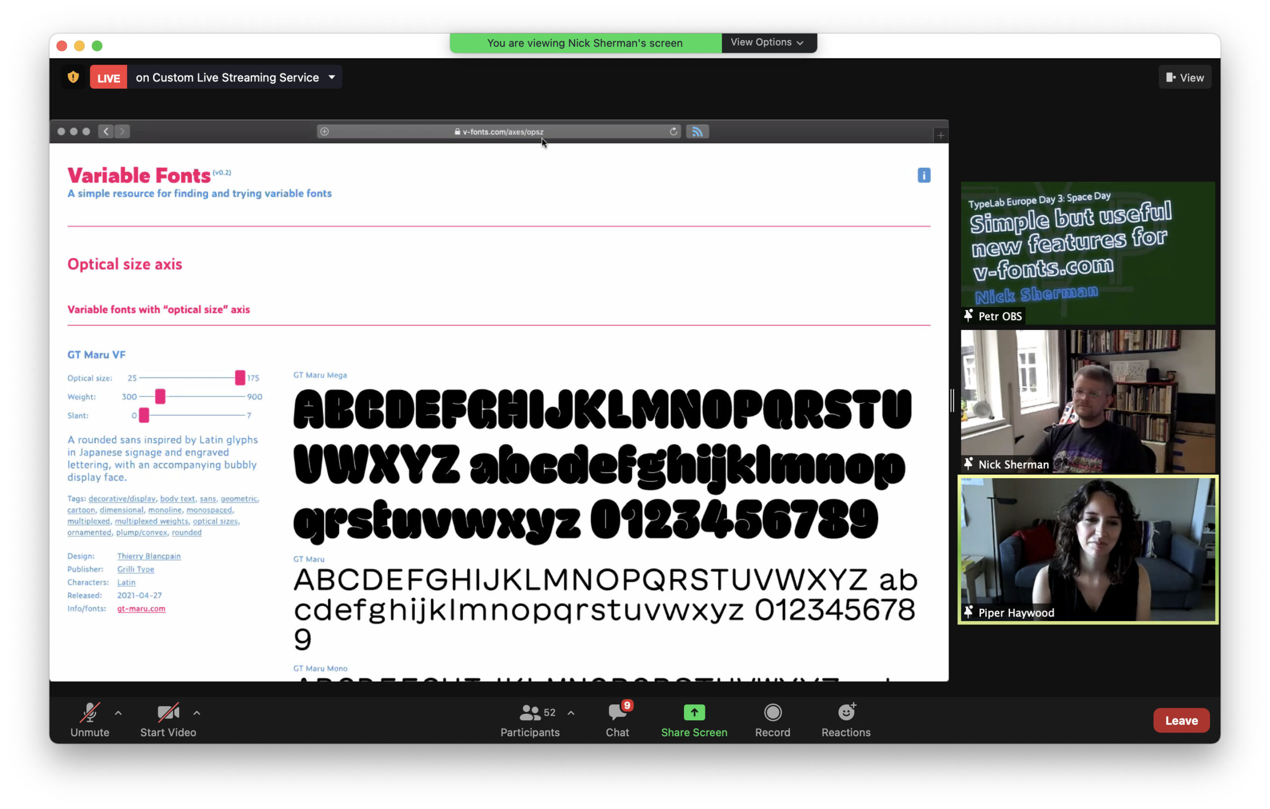
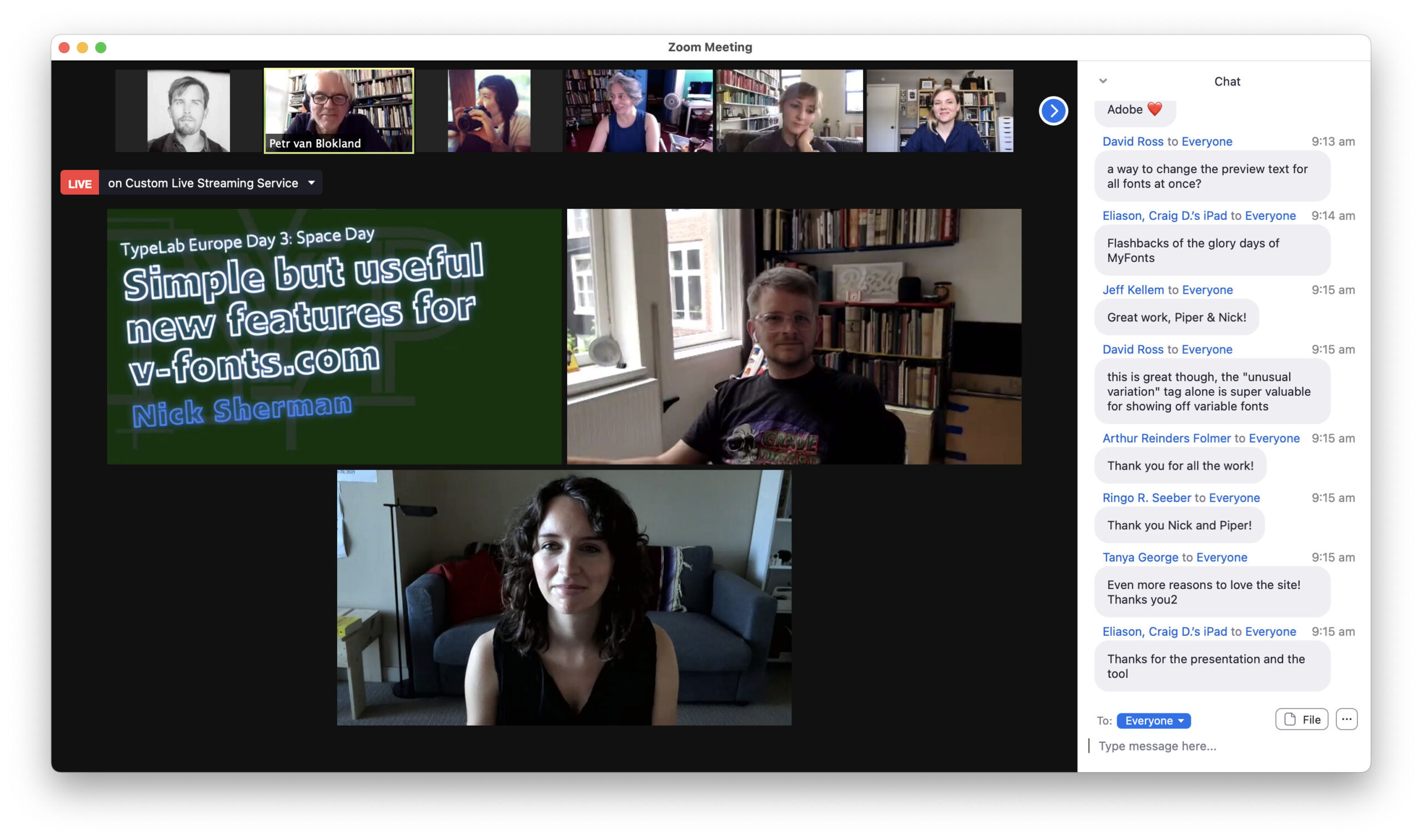
He managed to do it right before his TypeLab talk about these updates as part of Typographics 2021. He kindly invited me to join the talk, and it was a pleasure going through things together. Thank you to Petr Van Blokland for shifting things around so that I could contribute!

Screenshot from Nick Sherman and Piper Haywood’s talk about v-fonts.com as part of TypeLab

Screenshot from Nick Sherman and Piper Haywood’s talk about v-fonts.com as part of TypeLab

About the changes

For context/posterity:

Nick approached me about helping out with v-fonts.com after our back-and-forth about surface area-based logo sizing a little while back. I was pretty excited about the prospect since Nick’s a lovely guy, and I’ve found his Variable Fonts site so useful in the past!

The most major update is the introduction of term-based archives for tags (e.g. unusual variation or serif), designers (e.g. Elena Schneider), publishers (e.g. DJR), licenses (e.g. open source), and character sets (e.g. Cyrillic). These archive pages should make it a bit more straightforward to browse all of the listings, and they provide some useful context for the groupings. Nick has done phenomenal work curating it all.

Other updates include quantities to signpost how many results are returned and how many are left, better keyboard navigation for the sliders, and a RSS feed (yay!!). If RSS is your thing, you can find the link in the site footer.

There’s a lot more we’d like to do though.

For the future

A few enhancements for later down the line:

  • Automated content creation; we could potentially extract some data from the font files to speed up content editing/uploading; the Wakamai Fondue repo on GitHub by Roel Nieskens will no doubt be an invaluable resource for this!
  • Enhanced preview capability; would be nice to change the preview text and the size of the text
  • Automated font preview images for RSS

Things we’d like to get to sooner 🤞 include:

  • Filtering by axis (weight, slant, etc.); this sort of exists currently (see one of the screenshots above for an example), but we can’t really expose it yet due to some limitations
  • Prettier URLs for tags, with automated redirects from the old URLs
  • Sorting capability by things like the date the font was updated or alphabetical by title
  • Multi-dimensional filtering; would be nice to look at all of the serif fonts with extended Latin support that offer a trial, or check out all of the open source variable fonts published by Arrow Type, for example
  • Search!

We didn’t end up including these changes because we hit a few walls with the ExpressionEngine set up. EE is a great CMS, but unfortunately it doesn’t seem to give us quite enough control out-of-the-box for the more extended functionality we’re after. I explored add-ons and such for some of these things, but it quickly felt like too scrappy/hacky when there are other CMS options out there that would allow us to achieve this more maintainably.

So the next big step will likely be migrating to a different CMS. Big task (code, content, URL redirecting, etc.), but do-able! At the moment, I’m eyeing Craft CMS + the Feed Me plugin by the Craft developers for semi-automated content migration.

But it will be a few months before I take a look at it due to maternity leave coming up so soon, so we’ll evaluate the best CMS for the job then. I don’t expect a better CMS option for this particular project to come up between now and then but you never know, these things can move so fast!

Thanks for the screenshots, SB!

Published

Sass + Eleventy, remember to opt out of using .gitignore

I’m working on an Eleventy site at the moment, the first Eleventy site I’ve done that’s been complex enough CSS-wise to warrant using Sass. I’ve turned to Phil Hawksworth’s Sass + Eleventy technique for the job. It’s a great, simple way of using Sass with Eleventy with a little bit of preprocessing courtesy of Gulp.

Hit a wall at one point though, it was smooth sailing and then my CSS updates just stopped working.

Turns out I had added /_includes/main.css (the compiled styles) to my .gitignore file since I prefer not to commit compiled files, but I forgot that Eleventy uses the .gitignore file + the .eleventyignore file to decide what not to compile. So Eleventy was just ignoring it. 🤦🏻‍♀️

I did this .gitignore change as an end-of-day commit, tidying things up before closing my laptop. When I picked the project back up days later, it took me longer than I’d like to admit to figure out what was going on!

To sort it, I just had to opt out of using .gitignore by adding eleventyConfig.setUseGitIgnore(false); to the .eleventy.js config file, and then adding the necessary files listed in .gitignore to .eleventyignore. Then I re-ran gulp watch & npx eleventy --serve, and all was well.

Separate but related to static site generators: Check out Astro. Would be curious to see a detailed comparison of Eleventy vs Astro since Eleventy is currently top-of-the-list for me in terms of static site generators.

Published

Two articles on SPA or SPA-like sites vs alternatives

I missed these two articles by Tom MacWright from last year.

Second-guessing the modern web, 10 May 2020
If not SPAs, What?, 28 October 2020

In both, he outlines few upsides and downsides about the single page app (SPA) approach to websites and has a few points that I have really struggled to articulate in the past.

From “Second-guessing”:

There is a swath of use cases which would be hard without React and which aren’t complicated enough to push beyond React’s limits. But there are also a lot of problems for which I can’t see any concrete benefit to using React. Those are things like blogs, shopping-cart-websites, mostly-CRUD-and-forms-websites. For these things, all of the fancy optimizations are trying to get you closer to the performance you would’ve gotten if you just hadn’t used so much technology.

I’ve dabbled with React and Vue in small side projects and experiments. But the point above is the big reason I’ve never taken the time to sit down and learn either of them properly. For almost every client site I’ve ever done, it just didn’t make sense to make it an SPA.

And I’m not 100% sure, but I think this might contribute to longevity. Some of my clients are still working with the same sites I built for them nearly 10 years ago, a few with just minor security-related updates in the meantime and no other maintenance strictly required. That’s not to say that those sites couldn’t use a “lick of paint” to bring them in to the 2020s; the point is that they work. And for organizations working on really tight budgets, or budgets that fluctuate wildly due to public funding, stability is really important. They can’t afford a developer on retainer to keep things running smoothly.

But of course the SPA vibe is pretty attractive, particularly for cultural orgs. MacWright has some decent alternatives suggested in “If not SPAs” including Turbolinks, Barba.js, and instant.page. Will also mention MoOx/pjax since I’ve used it before for page transitions with very good results, but probably won’t use it in the future as it hasn’t been updated in a while.

And again, there’s the rub. The more non-native scripts, plugins, etc I use in a project, the more likely that it’s going to be a major headache (and thus major time/money for the client) for me to change things down the line if or when that bit of tech is no longer supported or has changed significantly.

So it’s not even so much about being wary of React or Vue, it’s about not making assumptions, being cautious and cognizant of future needs or restrictions when proposing a tech stack. Any tech stack you choose will ultimately become a ball-and-chain, not just those based on JavaScript frameworks. It’s just that the ball can sometimes be heavier than it needed to be, and you can anticipate that with a little foresight.

Published

Some long-winded thoughts on privacy policies and consent popups

This Q&A is compiled from conversations I have had with many, many clients and collaborators who have had a hard time navigating things like the GDPR, privacy policies, cookie notices, consent messaging, and other related topics.

Here are all the questions covered below:

Read more

Published

General maintenance tips for website owners

This was originally written as a bit of a guide for my clients and collaborators, an aggregation of similar tips I have given to many of them individually in the past in so many shorter emails and conversations. Since it is relevant to most website owners though regardless of their relationship with me, I decided to share it more broadly here.

Websites require maintenance, even those with the smallest of footprints.

This is what I would consider “bare minimum” website-related maintenance tasks including checking your payment methods and contact details, reviewing your login and security practices, performing updates and taking backups, and checking your privacy policy.

If you do fall behind on maintenance (it happens to the best of us!) and something goes wrong, at the very bottom you’ll find some tips on what to do if your site goes down suddenly.

The vast majority of these tasks do not require a web developer or IT person, almost anyone can perform this maintenance so long as you have access to necessary logins, can follow instructions, and are willing to set aside the time.

I say “almost anyone” because some people are understandably uncomfortable with wading in to this stuff, they may get confused or a bit daunted by the user interfaces they have to use. In that case, just be sure that you are working with someone that can hold your hand through it or can simply do it for you. Also, not everyone has access to all of their service providers. If you’re in a different situation, for example if you retain a web developer, design studio, or IT person to continuously maintain your website, then these are worthy topics to discuss with them but ultimately they will probably need to complete these tasks for you.

Of course there are other maintenance tasks that are super worthwhile. For example it might be worth checking search performance or 404 pages with Google Search Console if search engine optimization (SEO) is important to you, or to check analytics if that’s relevant to your site. And it’s worth speaking to your web developer about front-end maintenance. CSS and JavaScript gets better all the time, as do browsers, so old front-end behavior can really date a site.

But that’s all just the cherry on top. If you complete the tasks below I’d say you’re pretty golden, probably a step ahead of 80% of the site owners I’ve come across.

Read more

Published

Fix for overflow at top / bottom of screen when using CSS Scroll Snap

I’m currently working on a site that uses CSS Scroll Snap to frame some of the content nicely as you scroll through. In Chrome though, I was getting weird overflow issues at the top and bottom of the screen. If I scrolled to the bottom and then kept attempting to scroll down, it would gradually add more and more length to the page. Same with scrolling back up.

Adding overscroll-behavior-y: none; to the body element sorted it out. Read more about overscroll-behavior on MDN.

I originally tried to add this property to the html element since that’s the element with scroll-snap-type: y mandatory;. This didn’t work though, it seems that overscroll-behavior has to be on body.

Published

On personal sites, and adios analytics

I’ve been getting approached more and more by people that want to put a link to their company’s content on specific pages of my site. I’d be up for it if the linked content was super relevant and unique, the sort of thing I’d bookmark, but it never is. The link usually leads to a generic article filled with ads, pop-up newsletter requests, trackers, etc on some faceless blog. Often the actual link they send me has a URL parameter to track whether or not I’ve clicked it (where is the self-awareness?!). I get that their employer is probably making them do it, but it feels pretty icky.

Alongside that uptick in ick, I’ve felt my relationship with my site shifting over the past few months. I loved cultivating my own little slice of the internet for so long, and some of that joy is slipping away. Some of this is probably related to the pandemic, some of it is busyness and stress, and some of it is for sure related to our SF move.

I came across this tweet from @lil_morgy, she’s definitely identified part of the problem. I’ve spent more time on Twitter in the past few months due to both moving and the pandemic. While it has introduced me to some great people, it has also started warping my idea of what success can look like. Does it mean having at least 2k followers and firing off hot takes? Sure as hell feels like it when I open up Twitter. I don’t have hot takes, my brain isn’t wired that way and they leave me with a bad taste. I like the ones that simmer, a messy family-sized stew as opposed to a perfectly formed amuse-bouche of a thought. Where does that leave me?

On a separate topic, a few days ago I came across Jim Nielsen’s post Comparing Data in Netlify and Google Analytics. (To be honest, I came across it via @davatron5000, probably wouldn’t have seen it otherwise. So there are good sides to it…) It reminded me of the often-futile role of analytics on so many sites. So many of my clients have added analytics because they thought they had to have it, or they’ve been forced to have it by some public funding body. But more often than not they have no time or inclination to make use of the data they collect and even if they did, how accurate is it actually in the end? The analytics platforms usually get so much more out of that data than they do.

Anyways, this is a roundabout way of saying that I just pulled the plug on my self-hosted Matomo analytics instance. Feels good. Consider it a first step towards repairing my relationship with this site that I have cared for over many years.

Note: I still feel like Matomo is one of the better options out there if you must have client-side analytics (more on this), but it was just pointless for me. I rarely looked at it, and I think even the presence of it was pulling this site father away from what it is at its core.

At its core, this is a personal site. A personal site, to me, is a website whose primary editor and intended audience is one and the same, a single, solitary, individual. My personal site is a repository for my memories, experiences, feelings, recipes, tips, photos, and more. A lot of it stays private. The things that might be interesting or useful to others are made public. Regardless, it is an ever-growing extension of myself that I have total control over, my mirror and memory aid. I want to be able to look back at this when I’m eighty and thank my past self for surfacing things that I otherwise would have forgotten, the good and the bad.

But a personal site can be anything, and that’s the beauty of it. This is my site, long may it change.


An additional thought.

What is yours?

I love coming across personal sites, and I love helping people set them up. If you give it a stab and run in to trouble, or just have no idea where to start, reach out to me and I’ll try to give you some pointers or at least bore you to death with some worthwhile questions.
Published

Use Portfolio Starter to create a personal site with projects, pages, and posts

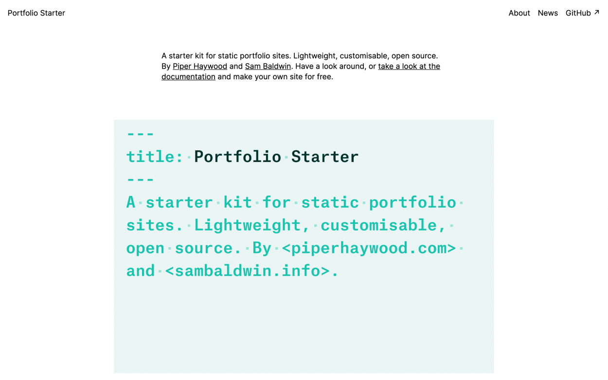
Screenshot of Portfolio Starter

This tutorial will teach you how to set up a personal website using Portfolio Starter, a starter kit for portfolio-driven websites made by Sam Baldwin and me. Check out the demo site to get a feel for how it looks, and visit the GitHub repo for more on how it works.

The tutorial is geared towards people that have little-to-no coding experience and are unfamiliar with things like GitHub, Eleventy, and Netlify. By the end of the tutorial you should understand terms like “repository” and “static site”; you’ll be able to edit your projects, pages, and posts; and your website will be hosted for free. Though basic experience with code such as HTML or CSS may be useful, it isn’t necessary for this tutorial since we’ll be using the hosting user interfaces to set this all up.

Let’s get started