Published

Rehearsing Rainbows

Early last year, Sarah Kate Wilson approached Musarc with a concept for a performance involving coloured mirrors. Around the same time, Toby O’Connor and I were mulling over ways of working with Beata Viscera, a conductus by medieval composer Pérotin. These experiments blended well and in April 2017, Musarc opened and closed the 3rd Do Disturb festival at Palais De Tokyo with Rainbows + Beata viscera iridis. Watch a video documenting Musarc’s various PDT performances on musarc.org. These pieces were performed again as part of MK Gallery’s 2017 CityFest and at Rochester Square’s Open Day on 24 June 2017.
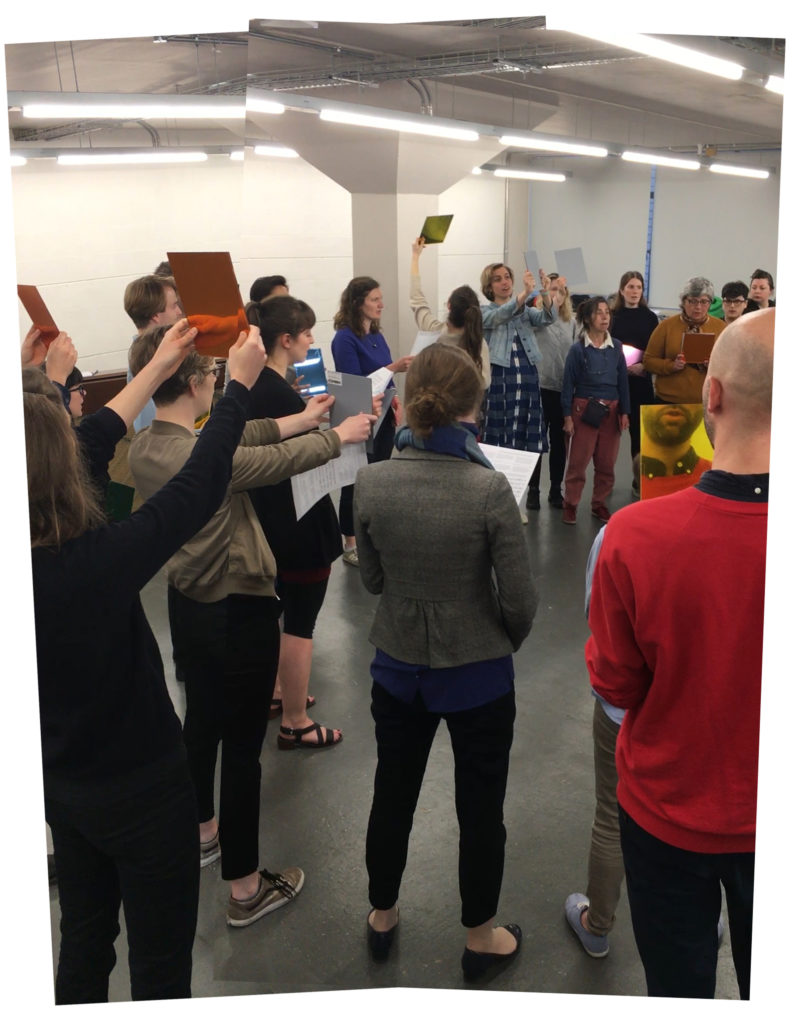
Musarc rehearsing Rainbows

Musarc rehearsing Rainbows + Beata viscera iridis at Central House just before the building was sold by London Met Uni.

Published

TL;DR almost all oils make seb derm worse

Simpleskincarescience.com on what/why certain ingredients exacerbate malassezia-caused skin conditions. This is the most comprehensive collection of information and research on the topic I’ve found online thus far.

TL;DR
Almost all oils, and many oil-based compounds such as fatty acids and esters, can feed malassezia. Many are common skincare ingredients. Read ingredient labels and when in doubt, go for things with fewer ingredients.

There are ingredient checkers online (skincarisma.com, sezia.co, etc.) that can help you weed out products with problematic ingredients. Note that if it’s labelled as bad for fungal acne, it’s also bad for seborrheic dermatitis.

Published

Chinese web font research

Did some research on Chinese web font best practices a while back when working on Memory Machine for Tyler Coburn + Asia Art Archive with Luke Gould. It was an interesting challenge. This was my overall takeaway from the research:

  • Self-hosted fonts are out, the font files are prohibitively enormous due to the number of characters
  • The Great Firewall can cause issues with most font services, so no Google Fonts or Typekit
  • If you need to render a mixture of Latin and Chinese characters and want them to use different fonts, the font stack structure and naming is critical (see article by Kendra Schaefer for more info)
  • Bold and italic should never be used for emphasis on Chinese characters since it distorts their meaning

Read more

Published

Lion-, Trigger-, and Bone-fish. Oh my!

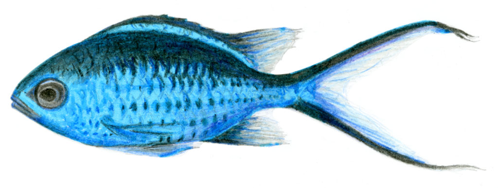
A graphite, coloured pencil, and highlighter drawing of a Blue Chromis

This is a semi-accurate inventory the wildlife we saw in Belize last month. The ocean-bound creatures and most birds were in the cayes off the coast from Dangriga, the Belize Barrier Reef, and Glover’s Reef. The others were mostly from the Caves Branch River southeast of Belmopan in the Cayo District.

Read more

Published

Tall, elegant time signatures

I recently came across a tall, one-per-system time signature style I hadn’t really seen before in Drei Volksliedsätze by Schönberg, published by Edition Peters (c) 1930.

Tall time signature in Drei Volksliedsätze by Arnold Schönberg

I searched around for some info about their purpose but didn’t find a ton of information. Some say that they are useful for conductor’s scores, others say that they’re useful when a time signature changes frequently throughout a piece. Most examples I’ve found are a lot more ungainly (but definitely more legible) than the tall, elegant time signatures in the Schönberg.

The usage isn’t consistent in the three songs. The first of the three (Schein uns, du liebe Sonne) has a standard one-per-stave time signature and is in 4/4 throughout. The second (Es gingen zwei Gespielen gut) is in 6/4 throughout and has a tall signature. The third (Herzlieblich Lieb, durch Scheiden) is a little nuts. It’s got tall time signatures and starts in 3/4, then packs 5 meter changes in to the remaining 21 measures.

The texture of the final two pieces, both rhythmically and harmonically, is much tighter than the first. Because of that, my feeling is that in this song cycle they’re maybe meant to encourage singers to read across the staves, to become more attuned to where they fit in as part of the whole. Would like to ask someone more knowledgeable in this sort of thing to see what they think.

Published

Tiny pat on the back

The e-newsletters we made for Penguin Classics got a mention in a recent newsletter from The Better Email [✉ ∞]. Made me smile. Here are a few newsletters from the Penguin Random House team that I particularly like.

Published

Shopify theme dev notes, early 2018

We’re picking up a Shopify site that was put on hold for a little bit, and I’m pleasantly surprised by a few things I’ve come across. The pause might have been blessing in disguise for the site on the whole. The dev tools have progressed a bit during the hiatus, and I’ve come across a Sections workaround that might 🤞 give a little more content flexibility beyond the homepage.

Read more