Published
Easter 1992
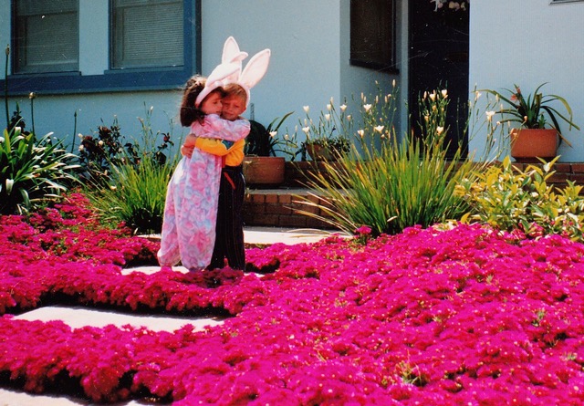
Easter 1992, photo taken by my mom, I think. Me and my best bud. I know iceplant is invasive in southern California, but man was it pretty.
Highlights, the important stuff. Things that I’ve written or posted about and want to draw particular attention to. Might be a personal win, a terrible event, a beautiful moment. Allsorts. Follow via RSS.
Published
Easter 1992, photo taken by my mom, I think. Me and my best bud. I know iceplant is invasive in southern California, but man was it pretty.
Published
We were due to move out of London on the 31st, and then we were going to live in West Yorkshire with Sam’s family for two weeks before leaving for the US. Obviously, that plan was shot to pieces.
We were still planning to move out on time until late Wednesday night when we realised that a lockdown in London could easily mean being stuck with nowhere to go. At around 5am on Thursday, we woke up and started packing. Sam got one of the last vans at Enterprise and we Tetris-ed things in to it until about 7pm when it was filled to the brim. We said goodbye to our home for the last 4+ years, and then he drove north while I failed to stay awake in the passenger seat. We listened to a few episodes of Answer Me This and The Mythos Suite, ended up rolling in to our destination around 1am.
Meet our new neighbours.
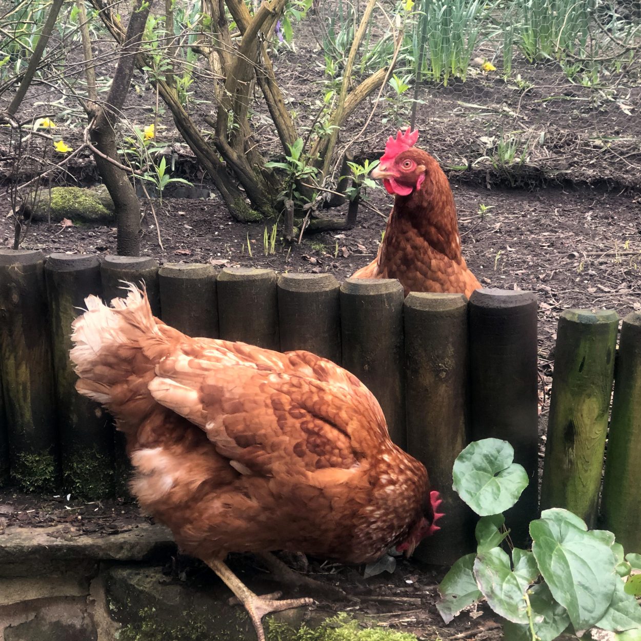
We’ll be staying in a few AirBnBs until things calm down a little bit and it makes sense to move to the US. It’s pretty good so far. We have already worked remotely for so long, we don’t have to make any major adjustments there. And it’s a beautiful part of the world, should be able to do a lot of walking.
Part of me feels really guilty about leaving, particularly when I think about what happened with the lockdown exodus in Italy and after reading this Guardian article. We don’t want to contribute to any problems, but we couldn’t stay.
We decided on Yorkshire because it was pretty much our original plan, though we’ll probably be here longer than we had planned and will rarely see family. We’re trying to stay as distant as possible. Living in a state of flux.
Published

We’ve been slowly packing up for the past month, preparing to move thousands of miles away. It was exciting up until about two weeks ago. We knew it would be sad to leave the people we love, pack away our books, sell so many of our things. But we were looking forward to a big change.
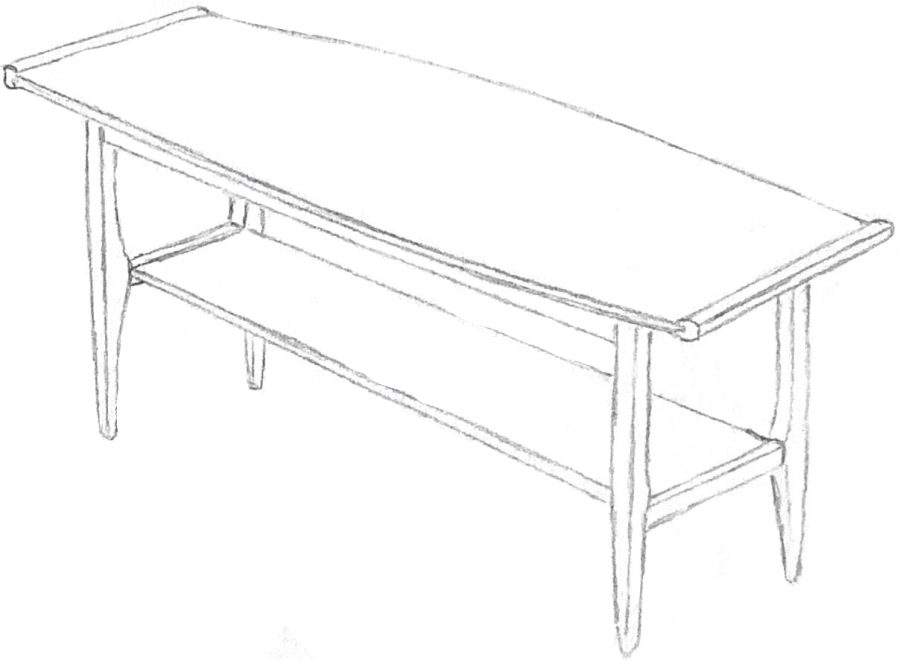
Now it feels untethering. Reality feels very thin at the moment, and the process of moving amplifies that feeling. Home should be a grounding place, but it’s shifting under our feet. We’ve disassembled our workspaces, we’ve given away the chairs and sold the monitors. The umbrella plant that I got at the flower market when I first moved here, the dracaena I brought back from the dead, the lovely coffee table we’ve had since we first started living together. They’ll all be gone by tomorrow.
I really don’t mind the downscaling. They’re just objects, and all of them are going to great homes. And we’re still going to move even if it gets delayed by current events, so it doesn’t make sense to hoard things for the sake of a few more weeks. But the *timing*. Things are dissolving and will be fluid for quite some time. I could really do with some solidity.
The worst part is that we may not get to say goodbye. We were planning to celebrate with the people we love. There’s an outside chance we’ll still be able to, but we don’t want to put friends in an uncomfortable or dangerous position.
What will happen will happen. And we’re pretty fortunate. It’s just sad, that’s all.
Published
I’m not going to lie, when I get a few drinks in me… I’m a little nasty to her. But it’s just one of those things.
Overheard on 10 April 2013 while sitting on the the upper deck of the 73 bus between Euston Station and King’s Cross, headed towards Stoke Newington. Said by a middle-aged businessman with a blue tie and London accent talking on a mobile.
Seems particularly awful since obviously there is self-awareness. He just doesn’t care enough to act differently.
***
Found in one of my old notebooks that I’m slowly de-cluttering.
Published
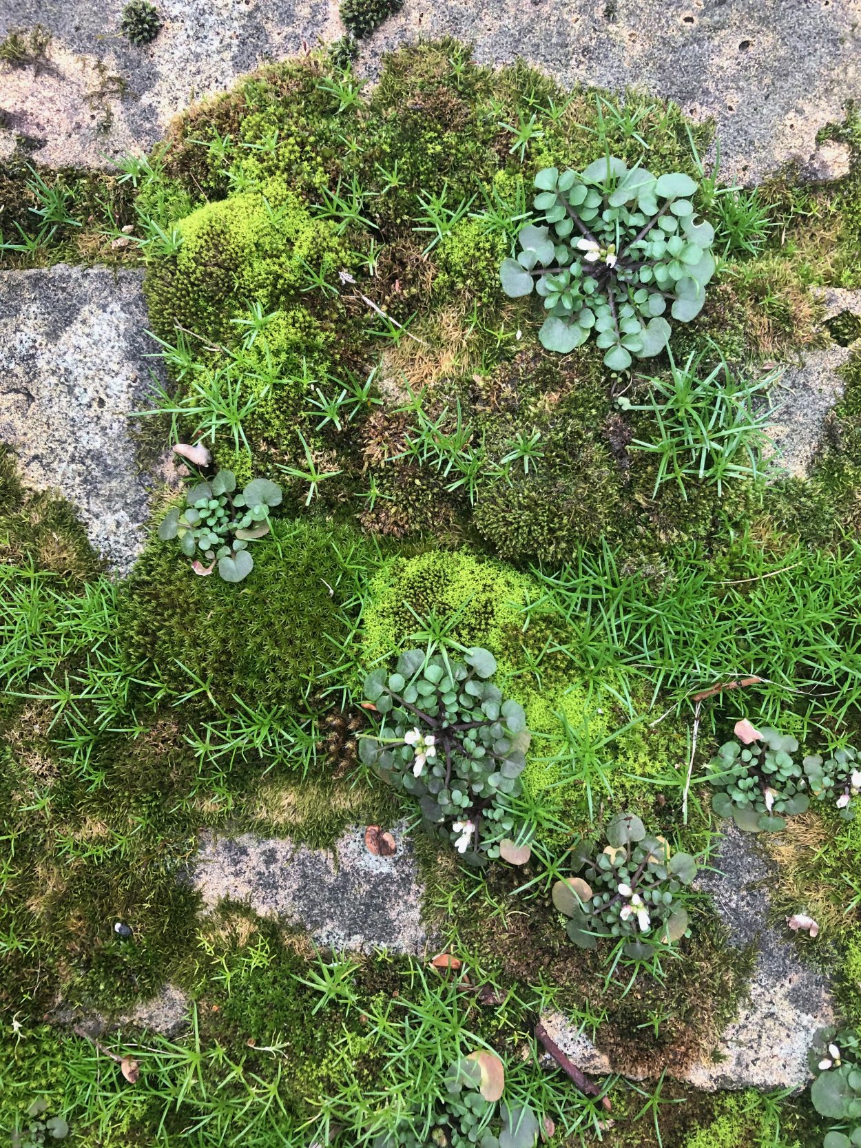
Saw these teeny tiny moss flowers on a walk with GC, BW, and HB yesterday. <3
Published
A short two-parter
I’m doing a few coding-for-designers workshops with the students in the MA Graphic Media Design programme at the LCC, the first one was this past Thursday.
We’re focusing on web stuff since that’s what they expressed the most interest in and it’s in my wheelhouse. We started with a broad and brief overview of code, about how we use human-readable programming languages to communicate with computers. But 99% of the time, when we say “human-readable” we really mean “English-based”. More on this later.
After my short intro, we put together a simple webpage with HTML and CSS. A few of the students ran in to a small-but-mighty bug that I’ve never encountered before.
We were working on a basic CSS rule set, something like:
body {
  background-color: linear-gradient(blue, pink);
}
And for one of the students, it just wasn’t working. I checked it a bunch of times, it was all typed perfectly. No missing spaces or characters, spelling was fine. VSCode indicated that the background-color declaration wasn’t finished, which seemed weird. I looked really closely at it and noticed that the semicolon seemed a little thinner than the others in the file.
Turns out that the student had typed a full-width semicolon (U+FF1B) instead of a semicolon (U+003B). The full-width semicolon is used in Chinese to “demarcate parallel structures in a paragraph”. Another student ran in to the same problem a few minutes later, using a full-width left curly bracket (U+FF5B) instead of a left curly bracket (U+007B).
I had asked them to type in a semicolon, to type in a curly bracket, and so they typed the characters the way they normally do in their native languages. Super understandable.
If you were just starting to learn what code is and how it works, I can’t imagine how hard it would be to debug this sort of language-based problem on your own.
Gretchen McCulloch wrote a very worthwhile Wired article titled “Coding Is for Everyone—as Long as You Speak English”. I feel like every programmer / dev should read it.
Programming doesn’t have to be English-centric. As McCulloch puts it:
The computer doesn’t care. The computer is already running an invisible program (a compiler) to translate your
IFor<body>into the 1s and 0s that it functions in, and it would function just as effectively if we used a potato emoji 🥔 to stand forIFand the obscure 15th century Cyrillic symbol multiocular O ꙮ to stand for<body>.
How would we go about implementing non-English HTML tags? W3C has an FAQ on the topic where they state that “HTML or XHTML tags are all pre-defined (in English) and must remain that way if they are to be correctly recognized by user agents (eg. browsers).”
Since browsers just implement the standards set by W3C (I’m pretty sure that’s right?), I’m guessing that W3C would have to approve it if we wanted native non-English HTML support. It seems like it would be a bit of a mountain to climb but if we take something like Wikipedia’s translation efforts as an example, surely there are tons of people out there that would help with translation?
Gonna keep an eye on this. Need to find a book or good article on the history of ALGOL.
Published
I want to get STRONG
Yoga is relaxing but expensive, and I’m not sure about learning it at home. Gyms suck. Swimming is *lovely* but doesn’t do my angry skin any favours. Can’t run much b/c of lifelong knee issue. Excuses, excuses.
At-home bodyweight exercises FTW. This is what I’ve been trying recently, every other day for about 30 minutes. I can do all of them within the confines of a yoga mat in my postage-stamp flat.
They’re based on a few decent exercise vids on YouTube, but I prefer not to refer to the full videos all the time. Too high-energy / shiny. Instead, I’ve got the movements programmed in to a circuit training app and I listen to that alongside a mix.
About 11 minutes. Need a yoga / exercise mat. Related video
 0:30 – Pulse lunge, left side
0:30 – Pulse lunge, right side
 0:30 – Lunge with leg raise
 0:30 – Jump squats
 0:30 – Side squat steps
 0:30 – Sumo squats
 0:30 – Abductor squats
Move to mat, tabletop position
 0:30 – Donkey kicks, left side
0:30 – Donkey kicks, right side
 0:30 – Fire hydrants to straight kick back, left side
0:30 – Fire hydrants to straight kick back, right side
Lie on stomach, head resting on forearms
 0:30 – Frog kicks, alternating legs
0:30 – Frog kicks, both legs
Lie on back
 0:30 – Glute bridge
 0:30 – One-leg glute bridge, left side
0:30 – One-leg glute bridge, right side
0:30 – Glute bridge, narrow stance
 0:30 – Glute bridge, alternating leg raise
 0:30 – Glute bridge, hold it
About 4 minutes. Completed standing in one spot, arms extended the whole time. These are hard to describe, see related video.
 0:30 – Arms extended, palms up and then down
 0:30 – Butterfly stroke then curling under as if holding beach ball
 0:20 – Pulsing with palms facing forward
0:20 – Pulsing with palms facing backward
 0:20 – Small circles clockwise
0:20 – Small circles counter-clockwise
 0:20 – Forward, bend elbows, up, down
 0:20 – Up, bend elbows, forward, back (reverse of above)
 0:20 – Straight arm clap
 0:30 – Trace ball in front
I’ll add more as I come across things that I like.
I found Piskel while writing this post, what a cool little site / tool. Neat CSS tip via SB: use image-rendering: crisp-edges for extra crispy pixel art.
Published
Every once in a while, I have to figure out how to display images on the web with a consistent surface area. It’s usually in relation to making a lot of logos with very different aspect ratios look evenly sized so that none of them stick out like a sore thumb.
I haven’t had to do this in a while but came across a tweet by Nick Sherman that prompted me to think about it again.
To achieve an evenly-sized group of images, you have to calculate a maximum width that is proportionate to the surface area you want. To do this, you need to be able to calculate a square root, you need the width and height of each original image, and all of your images need to be tightly cropped since extra negative space will throw things off visually.
In the past, I’ve achieved this with logic since vanilla CSS doesn’t currently support a sqrt() function (more on this later). I’ve usually used PHP since I tend to work with Kirby CMS pretty often.
The function in PHP:
function max_img_width($img_width, $img_height, $ideal_area) {
  $max_width = round($img_width * sqrt($ideal_area / ($img_width * $img_height)));
  echo $max_width;
}
And the function in use + corresponding HTML:
<img style="max-width: <?php max_img_width(1500, 3000, 40000); ?>px;" src="https://piperhaywood.com/my-image.jpg">There seems to be a CSS-only way to go about this though. Apparently you can approximate square roots in CSS by using a series of CSS variables and calc(), see more info in this thread.
I will warn you: this is ugly. Also, it heavily relies on CSS variables which may or may not work for you depending on your browser support requirements. Here’s the CSS and the image markup:
img {
  --width: 0;
  --height: 0;
  --ideal-area: 40000;
  --area: calc(var(--width) * var(--height));
  --ratio: calc(var(--ideal-area) / var(--area));
  --guess01: calc(calc(var(--ratio) + calc( var(--ratio) / var(--ratio))) / 2);
  --guess02: calc(calc(var(--guess01) + calc( var(--ratio) / var(--guess01))) / 2);
  --guess03: calc(calc(var(--guess02) + calc( var(--ratio) / var(--guess02))) / 2);
  --guess04: calc(calc(var(--guess03) + calc( var(--ratio) / var(--guess03))) / 2);
  --guess05: calc(calc(var(--guess04) + calc( var(--ratio) / var(--guess04))) / 2);
  --guess06: calc(calc(var(--guess05) + calc( var(--ratio) / var(--guess05))) / 2);
  --guess07: calc(calc(var(--guess06) + calc( var(--ratio) / var(--guess06))) / 2);
  --guess08: calc(calc(var(--guess07) + calc( var(--ratio) / var(--guess07))) / 2);
  max-width: calc(var(--width) * var(--guess08) / 2 * 1px);
}
<img style="--width: 1500; --height: 3000;" src="https://piperhaywood.com/my-image.jpg">I’d want to do some more browser testing since this results in a pretty gnarly calc() situation by --guess08, but at first glance this seems like it might be a worthwhile solution. It doesn’t give us exactly proportionate surface areas but it gets very close. It only starts to fall apart with super skyscraper-y and letterbox-y images.
A few quick notes regarding why this is written as it is and ways that it could be tweaked:
I capped the number of guesses at eight because any more seemed to just fail, Chrome and Safari wouldn’t interpret such a big calc() equation.
I set the default width and height to zero so that there is no max width restriction if the image tag is missing the width and height CSS variables. This could be changed, as could the ideal area variable (increase to get larger images, decrease to get smaller).
The 1px value in the max-width calculation is required so that the value is interpreted as a unit. That said, it doesn’t have to be pixels! Could change this to another unit like 1em or 1%.
If I wanted to display these evenly centred, I’d probably give the images some margin and then wrap them in a container with styles as below:
.container {
  align-items: center;
  display: flex;
  flex-wrap: wrap;
  justify-content: center;
}
Could also use CSS grid for a more consistent spacing result.
And a final reminder: this only visually scales the images. Try to avoid loading a 3000px wide image if you’re going to be displaying it around 200px wide, your users and the planet will thank you.
So apparently more complex math functions including sqrt() might be coming to CSS in the future! See this issue raised by Lea Verou in the CSS specifications editor’s drafts repo and the exponential functions section from CSS Values and Units Module Level 4 in the W3C editor’s draft from 3 February 2020 (a couple days ago!).
I’m not sure when this would become part of the spec and no idea if / when the browsers might implement them, but here is a snippet that should work with that new function in theory:
img {
  --width: 0;
  --height: 0;
  --ideal-area: 40000;
  max-width: calc(var(--width) * sqrt(calc(var(--ideal-area) / calc(var(--width) * var(--height)))) / 2 * 1px);
}
I’m happy that Nick asked the question on Twitter, I actually need this on an upcoming project where I’ve only got Twig to work with which doesn’t support square roots, and I’d prefer to avoid JavaScript in this instance. Hopefully this is the solution, will update here if so.
A picture says a thousand words, so see Nick’s very nice demo of area-based image sizing with CSS to check out one possible outcome.
Edited a few words for clarity, added Nick’s demo, added future example incorporating a CSS-based sqrt() function.
Thanks Sam Baldwin for bringing future math function support in CSS to my attention!
Simplified the PHP + HTML example.
The original PHP + HTML example used a --max-width CSS variable instead of just applying a max-width directly. I used a CSS variable because I thought that they were compliant with a strict Content Security Policy that includes the style-src directive set to unsafe-inline. That assumption was incorrect, though there does seem to be some discussion about the topic.
Thanks Lizzie Malcolm for questioning the CSS var usage in the PHP example!
Changed parenthesis-enclosed arithmetic so that each is enclosed in calc(). Plain CSS seems to interpret arithmetic enclosed in parenthesis just fine, but SASS doesn’t seem to like it.
Published
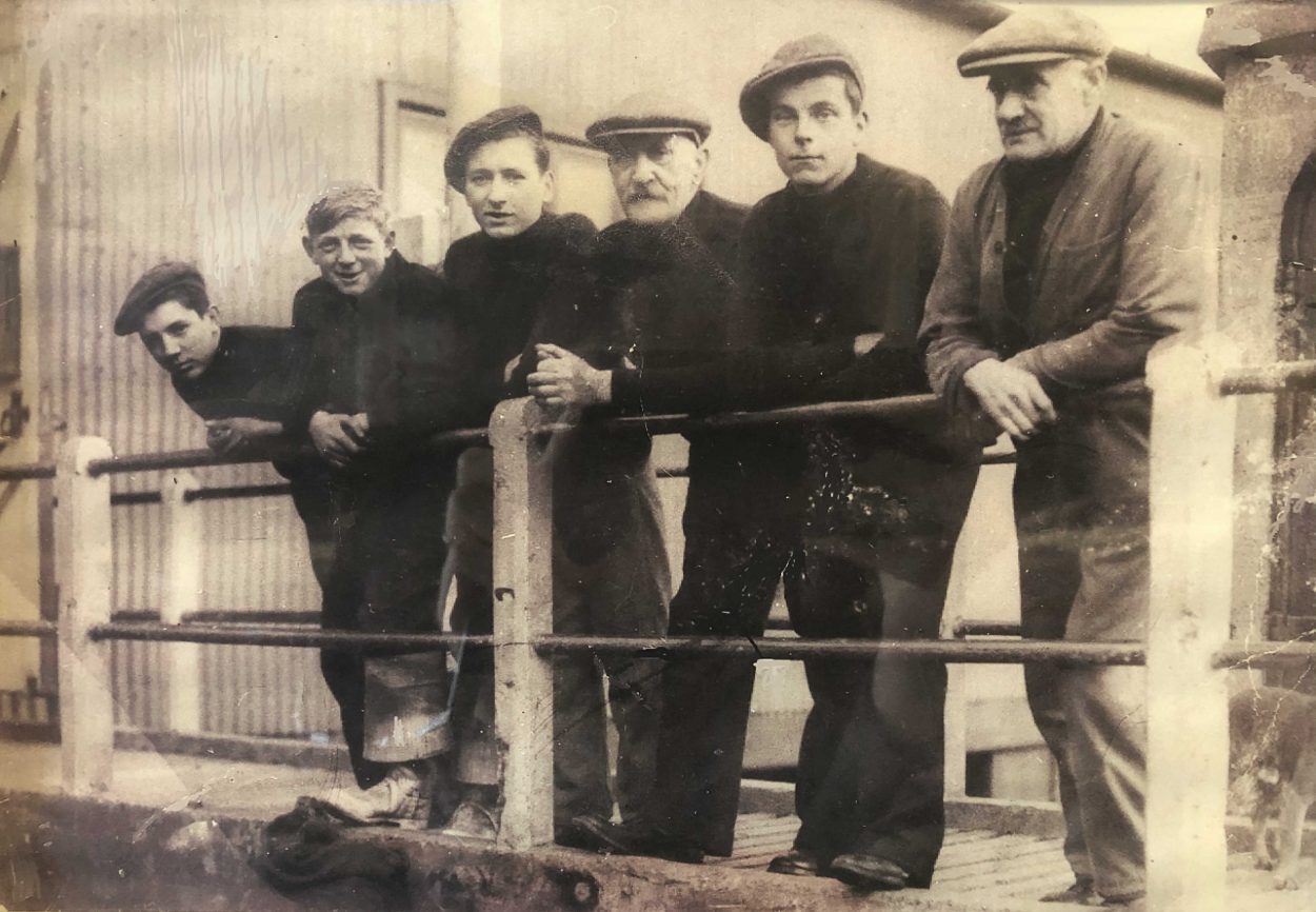
A story from the past via the Whitby Lifeboat Museum.
The museum is at the end of Pier Road just past the arcades in the old Whitby lifeboat station. The station was one of the first, established in 1802. It was taken over by the Royal National Lifeboat Institution (RNLI) after the 1861 lifeboat disaster which resulted in the tragic loss of 12 from a crew of 13. The station was closed and turned in to a museum in 1957 and was temporarily brought back in to service in 2005 while Whitby’s existing station was demolished and rebuilt.
YOUNGEST EVER LIFEBOAT CREW RESCUE AIRMEN

25th March 1942

At 10.55 am, a telephone message was sent to the lifeboat station from H.M. Coastguard stating that an aircraft was down in the sea 1 mile off Sandsend and that the lifeboat was
requested to launch immediately.

The Motor Mechanic Jim Philpott realised that all of the regular crew were at sea fishing, and after the maroons were fired, he subsequently managed to find a retired Coxswain Thomas Welham (71), and mustered 5 more crew who were all just 16 years old.

The lifeboat proceeded to sea in patchy fog and soon found traces of oil on the water. Eventually, after a short search, the lifeboat located a rubber dinghy with four aircrew inside.

The airmen were taken aboard the lifeboat suffering from head wounds and one a leg injury.

All were landed at the fish quay about 30 minutes later and transferred to Whitby Hospital.

The Aircraft was a Lockheed Hudson of the R.A.F. which had earlier sunk.


The photograph below shows, left to right:

F. Russell, P. Storr, T. Lewis, Cox T. Welham, R. Russell, J. Philpott

A photo of R. Murfield is not available.

Each man (and boy) received 19 shillings (95p) for their services.


The Pilot expressed gratitude to the lifeboat crew, and also his surprise at the speed of their rescue.
Published
This is super delayed! I typed up my rough notes right after MozFest finished in October but never pressed publish. Voila.
MozFest is 10 years old! This was their last year at Ravensbourne in London. Sad, but I’m excited to see where it heads next.
This is a haphazard brain-dump of everything I want to remember and follow up on, a lot of questions for future consideration and resources that I need to explore. See also Common Knowledge’s notes from MozFest written by Gemma Copeland.