Published

Visited “Nostalgia & Progress: Illustration after the Second World War”

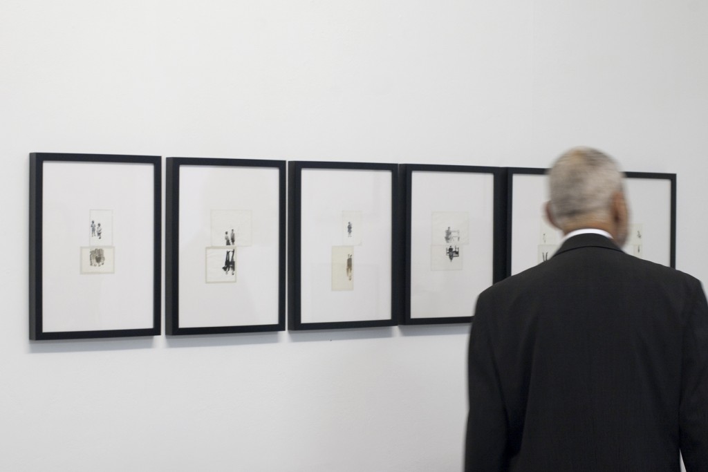
Had the pleasure of checking out Nostalgia & Progress: Illustration after the Second World War last weekend at Leeds Uni. There was quite a range of work on display, and together it made for a very enjoyable experience.

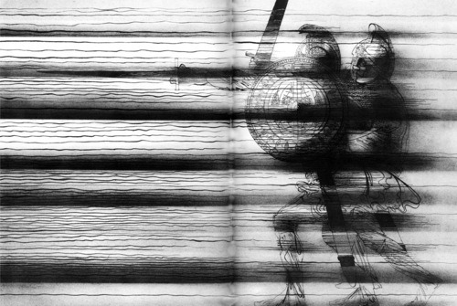
Somewhat embarrassingly, I’m not very knowledgeable about influential illustrators. That said, I could tell there were a few big names in the exhibition. I erred on the side of caution and didn’t take any photos, regretting that now. Two pieces by Charles Keeping, There had never been such a battle and an illustration from The Highwayman, were particularly arresting, and I can’t find them anywhere online. At any rate, the image here is an example of his work.

There were some more contemporary illustrators as well, two of which I’m lucky to know. William Goldsmith and Louise Lockhart had some lovely work on display.

The exhibition is on at The Stanley and Audrey Burton Gallery in Leeds University Library until 28 February 2015, so perhaps I’ll head back to try and grab a few photos (after asking, of course of course!).
Published

Ken Garland, First Things First

Look in to Ken Garland’s First Things First manifesto, particularly his reflection on its impact over the years, how it has or hasn’t been misinterpreted, the original signatories I’m not familiar with. I think there’s a bit of information about this around page 40 of Ken Garland: Structure and Substance by Adrian Shaughnessy. Haven’t yet had the pleasure of reading the book, but read a few extracts last night after Garland’s (great) talk and book launch last night at Sheffield Hallam. The Garland exhibition in the Cantor Building gallery is on until 9 November. 

Incidentally, the electric doors at the main entrance to the Cantor building sound like dubstep. Cannot be unheard…

Published

Claude Parent at the Tate Liverpool

Panoramic photo of Claud Parent's architectural intervention in the Tate Liverpool

Another favourite part of the 2014 Liverpool Biennial, Claude Parent’s La colline de l’art in the Wolfson Gallery on the ground floor at the Tate Liverpool.

Particularly enjoyed the way the light was diffused and altered for works with very reflective surfaces or cases.

I really enjoyed Liechtenstein’s Moonscape, a screenprint on iridescent blue plastic. It seemed smaller and more experimental than his more famous pieces, and more reserved. You walk up a long ramp in Parent’s space to reach the piece and end up viewing it on a raised platform, a dead-end and the highest point in the gallery. That’s where I took the iffy panorama above. The photo doesn’t do it justice, but hopefully it gives an impression of the extent of Parent’s architectural intervention within the space.

Published

2014 Bloomberg New Contemporaries

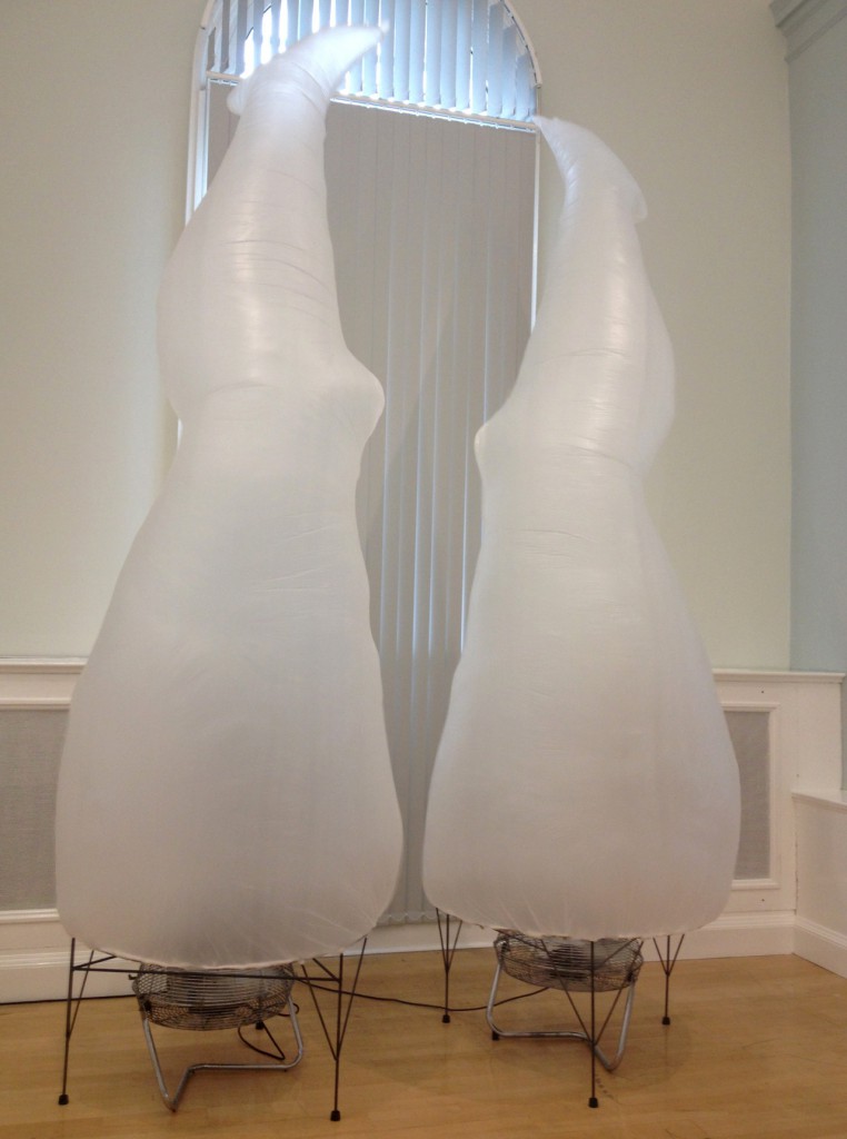
Photo of piece titled Pillars II by Katie Hayward

Katie Hayward
Pillars II, 2014
Plastic and industrial fans
Dimensions variable

Took the train to Liverpool recently for the Adrian Henry: Total Artist book launch (published by Occasional Papers, buy it here), and tried to cram in the entire Liverpool Biennial in that one day.

The piece above is part of the 2014 Bloomberg New Contemporaries exhibition in the World Museum and was probably one of my favourite works in the show. Details below the photo (taken on my phone, doesn’t do her piece justice). I don’t think the artist has a personal website just yet, but there’s a bit of information about her here and here.

There was a separate, very loud installation in this part of the exhibition that, IMO, was unfortunately presented. I don’t mind loud sound installations, but the positioning didn’t seem carefully considered in this instance. Sound travels far and fast in those cuboid, hard-surfaced rooms.

Read more

Published

XYT: Detroit Streets

Been away from the desk for a while, and thus the blog has been on hiatus. With good reason, though: I was on holiday in the states at long last! Got to participate in two friends’ lovely wedding outside Boston, and then we visited family in Nashville, the south coast of Lake Michigan, and Chicago.

Sam was a lucky duck and got to spend a day exploring on his own in the windy city. He saw a ton, including XYT: Detroit Streets, an installation by Zago Architecture at The Art Institute of Chicago. He filmed a little sample of it on his phone. Wish I could have seen it in person.

Watch clip (YouTube)

Published

The Mac Photographic Archive

The Mac Photographic Archive

The Mac Photographic Archive was started by GSA graduate Lizzie Malcolm and Daniel Powers following the fire that consumed much of the Macintosh Building at the Glasgow School of Art. Anyone who has ever visited the building can upload photos in an effort to digitally preserve the history of the iconic building. The archive is growing, but they’re still lacking photos of some areas (particularly the studios). If you have something to share, contribute.

Published

Note Note Tote by Sally and Peter Nencini

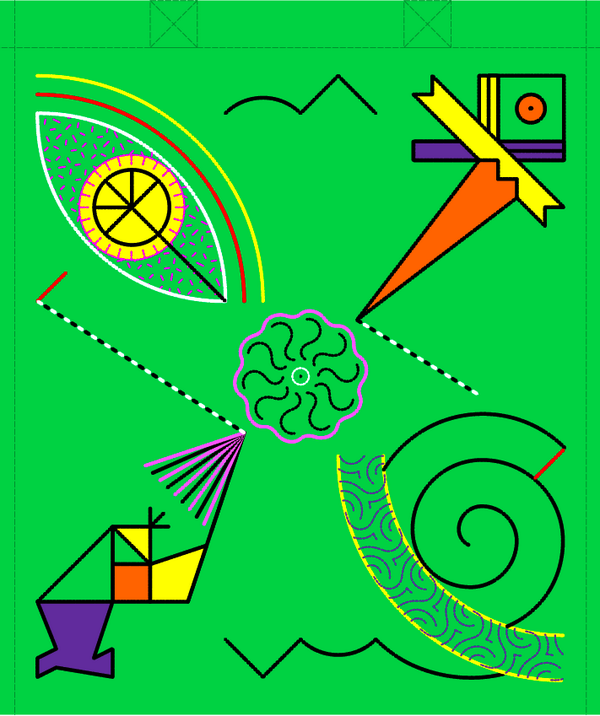
Brightly-coloured totebag design by Peter Nencini

Design for an embroidered tote bag by Peter and Sally Nencini (image source)

Posting this design by Peter Nencini for reference as I finish my Note Note Tote. I learned so very much from Sally and Peter at the stitching workshop yesterday at the Tetley, looking forward to finishing the tote. However, must be wary of embroidering while fatigued. I’ve got a few new holes in my index finger.

Update: Embroidery thread colours for reference below (brand is Anchor, about 70p per skein online)

  • Purple 111
  • Yellow 291
  • Orange 330
  • Green 228
  • Pink 57
  • White 1
  • Black 403