Published
“Be Kind” by Glad Hand
Listen to Glad Hand album by Be Kind (Bandcamp)
Sunday listening. What talented dudes.
Published
Listen to Glad Hand album by Be Kind (Bandcamp)
Sunday listening. What talented dudes.
Published
We’re working on a new site for SB-PH at the moment, and we’re using Airtable to get our project documentation together. It’s also a good opportunity to test the platform a little (+ I’m a fan of tables). To grab tidy JSON for use with data-friendly design software like Sketch, we’re using the Airtable API with cURL and ./jq.
Simple example that dumps table records in to a JSON file for use with the the Sketch Data Populator plugin:
$ curl https://api.airtable.com/v0/YOUR_BASE_KEY/YOUR_TABLE_NAME -H "Authorization: Bearer YOUR_API_KEY" | jq '.records' > records.json
Published
Aside: Thumbs up to Katie Floyd’s Policies info. Super clear.
Edit: See well-timed Guardian article “Ask Jack: Should I buy a NAS drive to back up my laptop?”
Edit 15 March 2019: Katie Floyd seems to have taken her site offline, and her post about NAS usage isn’t archived in the Wayback Machine. 🙁
Published

Published
Surfing w/ coffee #3. Order of exploration, seems more single-track than usual:
A
Open Hacker News, drawn to Frequent versus infrequent developers (in languages and so on) (↓B) (↓C)
B
Is it worth the time? on XKCD; pleased to find this again
C
Hello, I am a DWiki (↓D)
D
Wiki Principles (↓E)
E
Wiki Is Not Wikipedia (↓F)
F
GitHub repo for remodelling wiki as a single page application (↓G)
G
Cunningham & Cunningham Inc., “a small consultancy that has specialized in object-oriented programming” (↓H) (↓I) (↓J)
H
Plate Blading; “As he skates away he feels the need to fabricate further explanation.”
I
C2.COM as Public Space; “Have you ever noticed that some publicly owned museums can be hard to see while privately owned billboards are hard to avoid?”
J
Expense calculator shell script
Published

Detail from a graphite drawing completed late last year
Published
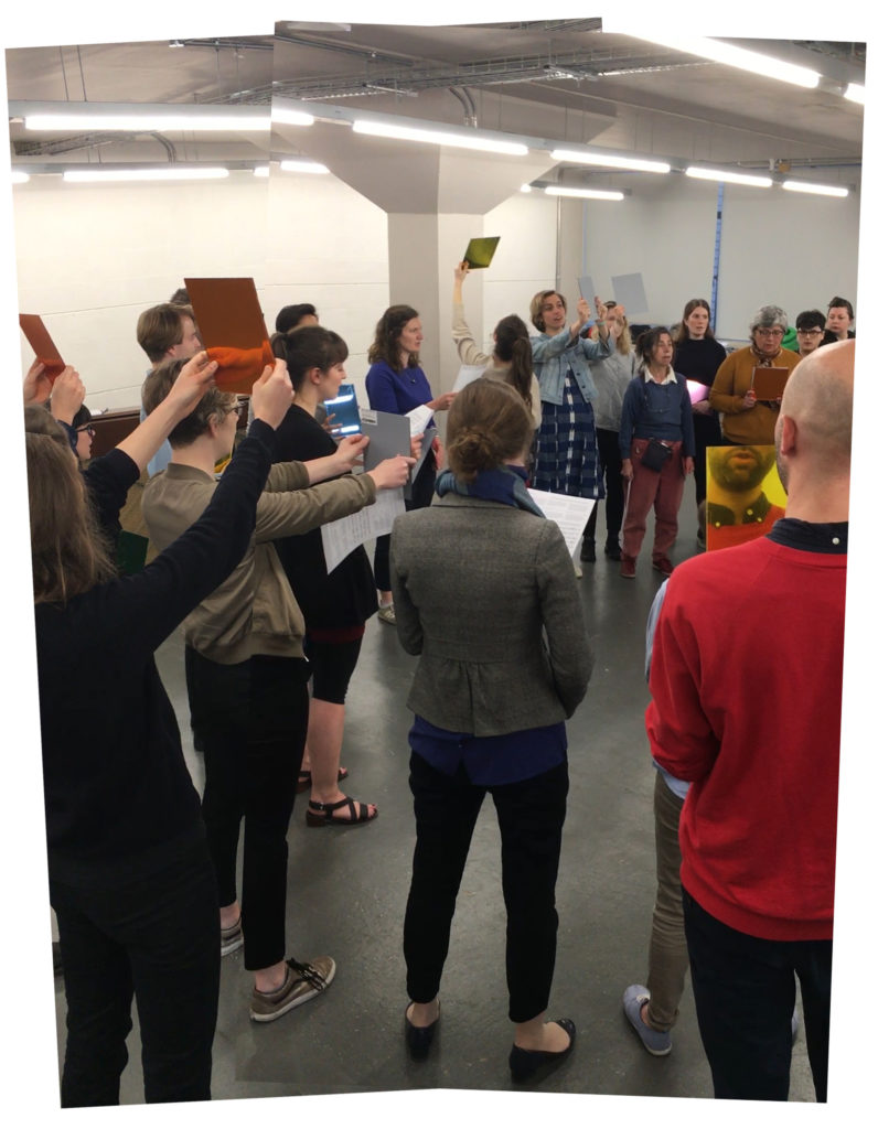
Early last year, Sarah Kate Wilson approached Musarc with a concept for a performance involving coloured mirrors. Around the same time, Toby O’Connor and I were mulling over ways of working with Beata Viscera, a conductus by medieval composer Pérotin. These experiments blended well and in April 2017, Musarc opened and closed the 3rd Do Disturb festival at Palais De Tokyo with Rainbows + Beata viscera iridis. Watch a video documenting Musarc’s various PDT performances on musarc.org. These pieces were performed again as part of MK Gallery’s 2017 CityFest and at Rochester Square’s Open Day on 24 June 2017.

Musarc rehearsing Rainbows + Beata viscera iridis at Central House just before the building was sold by London Met Uni.
Published
Simpleskincarescience.com on what/why certain ingredients exacerbate malassezia-caused skin conditions. This is the most comprehensive collection of information and research on the topic I’ve found online thus far.
TL;DR
Almost all oils, and many oil-based compounds such as fatty acids and esters, can feed malassezia. Many are common skincare ingredients. Read ingredient labels and when in doubt, go for things with fewer ingredients.
There are ingredient checkers online (skincarisma.com, sezia.co, etc.) that can help you weed out products with problematic ingredients. Note that if it’s labelled as bad for fungal acne, it’s also bad for seborrheic dermatitis.
Published
Did some research on Chinese web font best practices a while back when working on Memory Machine for Tyler Coburn + Asia Art Archive with Luke Gould. It was an interesting challenge. This was my overall takeaway from the research:
Published
Made a visual inventory of the fish we saw in Belize. The music is “Surfboard” by the excellent Roberto Menescal. Filmed by Brett and me, edited inexpertly by me. Watch video (Vimeo)