Published

Hannah’s Rietveld crate chair and other DIY furniture

HB gave herself a scrapheap challenge and made a Rietveld crate chair. I’m green with envy, it looks so great. She said it’s super comfy, which makes sense given the Adirondack-y angles and nice big armrests wide enough to rest a drink. Photos below are from the lady herself.
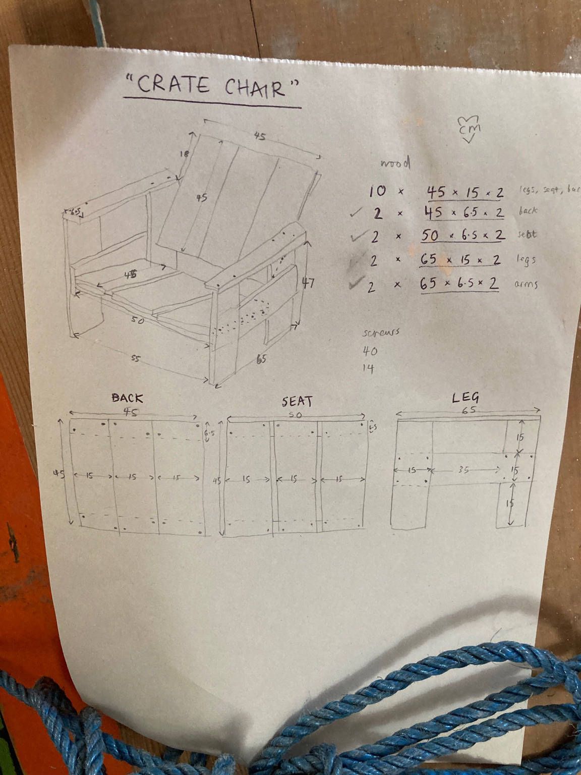
Plans for a Rietveld crate chair drawn by Hannah Blows

Hannah’s plans

Woman sitting in Rietveld crate chair in garden with a cat behind her

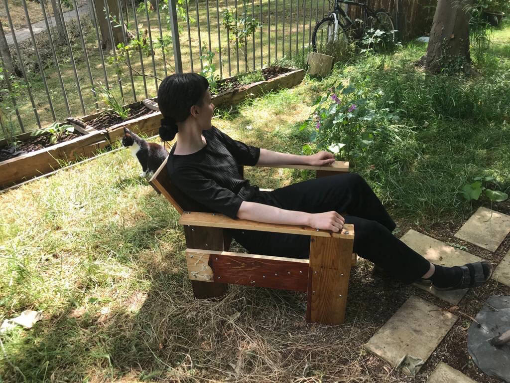
Hannah relaxing in the finished product with a friend in the bg

Definitely would like to make this, we need some furniture. Note to self: minute differences in the angles, measurements, screw placement, materials, etc. make a big difference in the final result. Tread with care and joy.

In relation to the crate chair, see also Rietveld’s original plans, Self-assembly’s instructions, and Susan Young’s Instructables post.


Other beginner-friendly DIY furniture

For other beginner-friendly DIY furniture that is geared towards simplicity (fewer cuts, mostly right angles, straightforward lumber sizes, not much fuss in finishing, etc.), check out: RietveldBuilder, this Rietveld couch plan on Etsy, Van Bo Le-Mentzel’s Berliner Hocker, Ian Anderson’s Two-by-two chair on Self-assembly, the Wave Hill Garden Chair (inspired by Rietveld’s Red Blue chair), Rietveld’s Beugel chair (I can imagine tweaking this design slightly to be more easily made with few tools), Jesse Kamm and her husband’s Donald Judd-inspired furniture, Judd’s original wood furniture that one could attempt…

I’m sure there’s a lot more along these lines out there by more female and less Euro-centric designers, would love to see other inspo and plans.

Materials and tools

If you’re not salvaging, then you have to select materials at some point. Popular Woodworking has some good writing on this topic, particularly their Choose the Right Plywood, How to Prepare Construction Lumber for Furniture, and What’s the Difference Between Screws? articles. Some DIY furniture plans like Enzo Mari’s Autoprogetazzione call for nails, but most of the time you’re better off with screws and glue for longevity.

The bare minimum of tools I like to have around for a DIY furniture project along these lines includes: a sliding t-bevel + protractor or a combination square; a sharp hand saw (read about Japanese pull saws vs Western push saws); multiple grades of sandpaper; a drill with a bit for pilot holes; a screw driver that matches up with your screw heads; a long metal ruler; a pencil; and a good vacuum. Additional items that are great to have include: a chop saw or table saw; a countersink bit attachment; and clamps.

Measurements are such a critical part of furniture making. If interested in figuring out how to choose good measuring tools, see Popular Woodworking’s “Precision Instruments for Woodworkers” parts 1, 2, 3, and 4. You probably don’t need crazy high-quality tools for the sorts of DIY furniture I’m talking about here, but if you’re buying a new tool, you might as well buy the best you can afford.

Edited 26 June 2020 at 11:30am to add notes about materials and tools and to add Self-Assembly links since it’s back online.

Published

Date-based colour

Read “Dynamic, Date-Based Color with JavaScript, HSL, and CSS Variables” by Rob Weychert

This is such a useful article. His implementation on Tinnitus Tracker is definitely more involved than what I’ve done on this site, particularly what he’s done to account for inherent saturation levels and lightness vs luminance. And his colour wheel mapping is slightly offset from mine. I feel like August is the reddest month! I’ve wanted to reconsider the colour here for a while, particularly since the accessibility of some of the hues isn’t up-to-snuff. Rob’s write-up might make that adjustment a bit more straightforward which is a big relief.

I remember being really interested in where Grant Custer went with colour on his blog when I started screwing around with colour on this site. See his blog in 2013 on the Internet Archive. I wanted to see whether or not there was some way to ambiguously reflect where I was in the world, particularly since I live so far away from most of my family.

The first version of the colour experimentation on this site mapped the HSL values to the season, temperature, and time of day where I was at the time the site was visited. This is an example from Paris in late 2016. The hue value was mapped to the date/season (same as now), and the lightness was mapped to the time of day using Moment.js and Moment Timezone. The goal was to map the saturation to the weather where I was using the OpenWeatherMap API with stormy and cloudy days being less saturated, but that never came to be since the weather descriptions weren’t consistent enough. I ended up mapping the saturation to the temperature instead, but I don’t think it was quite as effective.

When I turned the site in to a blog first and foremost, I dropped the location and weather aspect. It could be fun to return to it since it might bring a bit more variation, particularly on the list page. Might be a little wild though, and it might be a massive headache to introduce location and weather on old posts… At bare minimum, I could probably incorporate the time of day as lightness. We’ll see!

Published

“I don’t think we know how to separate when we’re feeling pity and when we’re feeling inspiration.”

A short surfing with coffee. It’s getting quiet as clients and collaborators head off for the holidays, so I played inbox catch-up this morning

Issue 227 of Rachel Andrew’s CSS Layout News is full of excellent reading and listening related to accessible and inclusive design. The link I dug most in to was “Future Accessibility Guidelines—for People Who Can’t Wait to Read Them” by Alan Dalton. His article led me to Liz Jackson’s Interaction 2019 keynote “Empathy reifies disability stigmas”. Part way through, she recommends the book Pathological Altruism. Looks like a big read (and it’s not cheap!) but it seems very worthwhile.

From about 8min 28sec in to her talk:

Step two of the design thinking process is defining the problem — but because disabled people are rarely able to lead, it often becomes us that are defined as the problem rather than the problem being defined as the problem. It becomes about what we can or can’t do, rather than how something does or doesn’t work for us.

So you have our insights gleaned, we’re defined as the problem, and then designers enter this iterative process of ideation, prototyping, and testing which leads to the unacknowledged stick stepper design thinking or as I call it, design thanking.

Because we’re expected to be grateful for that which has been done for us.

Her talk is roughly 20 minutes long and well worth a watch.

Thanks to Sam for the CSS Layout News recommendation.

Published

Notes from MozFest 2019

This is super delayed! I typed up my rough notes right after MozFest finished in October but never pressed publish. Voila.

MozFest is 10 years old! This was their last year at Ravensbourne in London. Sad, but I’m excited to see where it heads next.

This is a haphazard brain-dump of everything I want to remember and follow up on, a lot of questions for future consideration and resources that I need to explore. See also Common Knowledge’s notes from MozFest written by Gemma Copeland.

Read more

Published

Reading via Victor Papanek

Two more books for the reading list: Future Shock by Alvin and Heidi Toffler and Small is Beautiful: A Study of Economics As If People Mattered by E.F. Schumacher.

These suggestions come via Victor Papanek’s preface to the first edition of his book Design for the Real World: Human Ecology and Social Change. I finally started reading it at long last after many recommendations from SB.

Published

Notes from Redecentralize 2019

Been a busy few days with Redecentralize on Friday followed by MozFest over the weekend. Redecentralize was a one-day unconference at 4th Floor Studios in Whitechapel. The event was expertly organised by Ira Bolychevsky and her crack team.

It was a day of thought-provoking conversations and notebook scribbling. This is an attempt to decode the scribbles, make some follow-up plans, and to generally summarise the day from my perspective. There was a lot going on so I can’t cover it all, but I’m going to keep an eye out for other people’s notes via the Redecentralize newsletter.

\              \                      \                   \
\\\   \   \    \\            \        \\       \       \  \\
\\\\\ \\\ \\\  \\\   \    \  \\     \ \\\  \   \\  \   \\ \\\ \
\\ \\\\\\\\\\\ \\\\ \\\\  \\\\\\   \\\\\\\\\\\ \\\ \\\ \\\\\\\\
\\   \\\  \\\\\\\ \\\\\\\\\\\\\\\\\\\\\\ \\ \\\\\\\\\\\\\\\\  \
 \     \    \\  \   \    \\\  \  \\\   \  \   \\\ \\\ \\\  \   
              \            \       \            \   \   \

Read more

Published

Mom’s dry-transfer lettering sheets

Sheet of white dry-transfer type in 36pt Futura Bold

How to use instant lettering

  1. Remove blue backing paper and position sheet on working surface. Shade lightly over the letter with a ballpoint pen.
  2. Gently peel away sheet – the letter is now transferred. Repeat until your lettering is complete.
  3. Re-burnish through backing paper over copy for firmer adhesion.

Finally sat down to take pics of Mom’s old dry-transfer lettering.

See more

Published

Title illustrations from Oct 1967 issue of speculative fiction mag New Worlds

Micheal Butterworth kindly brought a bunch of original copies of New Worlds and Corridor to a recent Corridor8 meeting in Wakefield. It was a pleasure to thumb through them, particularly as Hannah Nussbaum gave us a peek in to her research on Micheal’s body of work and the roots of Corridor8.

The images here are illustrated titles from the October 1967 issue of New Worlds edited by Micheal Moorcock.

Published

“These things I believe”

Might be at a turning point in my career. A lot of my friends are expressing similar feelings. I think it has something to do with working for nearly 10 years.

This frame of mind has made me really interested in manifestos. Not anything strident really, more purpose-driven lists that can help guide everyday decision-making. Here are a few manifesto-y links I’ve identified with recently.

  • These things I believe from “Not the user’s fault”. I think this is Jono Xia’s blog from when he was part of the Mozilla Labs team. I’ve tried to find him elsewhere on the web but haven’t found him anywhere so far. He raises some really good points about software design and development.
  • The Recurse Center’s Social Rules. Such a good, concise set of guidelines for public discourse. “No well-actually’s, no feigned surprise, no backseat driving, no subtle -isms”.
  • Immaculate Heart College Art Department Rules. Also available as a free tear-away poster at the Corita Kent: Power Up exhibition (8 Feb – 12 May 2019) at the House of Illustration.
  • GitLab’s Remote Manifesto. SB and I try to implement a lot of this, though we’re definitely not strict enough about it! We also strive to work this way with clients and collaborators, even those that live in London. Face-to-face IRL meetings are great, but it can be tough to squeeze them in when it takes an hour to get anywhere in this city.
  • Daniel Eatock’s manifesto, particularly “propose honesty as a solution”. See also the Scratching the Surface episode with Daniel Eatock from last September. Off the back of the Corita Kent exhibition, SB and I were talking about the lack of irony and cynicism in her work, about how refreshing that feels even though a lot of it is from over 50 years ago. He mentioned this podcast episode, that Eatock touches on this topic in relation to his kids, how kids just don’t perceive irony. I need to have a listen.

I’ll try to add more here as I come across them. Who knows, maybe I’ll add my own some day.

Published

moreish

“Moreish” is a word that doesn’t exist in American English, but it should.

We were discussing moreish-ness in relation to oatmeal cookies the other day. What makes a food moreish, something that hits the spot but also leaves a void, leaves you wanting a little more?

At the time, I felt that it requires multi-dimensionality, just enough contrast. When something is too on-the-nose, it isn’t moreish. Cookies without a pinch of salt, tomato sauce without a little sweetness.

Since then I’ve been thinking about moreish-ness a lot outside of the context of food, and the contrast idea stands up.

Outfits, websites, books, relationships. Requires more exploration.